Wednesday, 27 June 2018

The Sonos Beam is the soundbar evolved

Sonos has always gone its own way. The speaker manufacturer dedicated itself to network-connected speakers before there were home networks and they sold a tablet-like remote control before there were tablets. Their surround sound systems install quickly and run seamlessly. You can buy a few speakers, tap a few buttons, and have 5.1 sound in less time than it takes to pull a traditional home audio system out of its shipping box.

This latest model is an addition to the Sonos line and is sold alongside the Playbase – a lumpen soundbar designed to sit directly underneath TVs not attached to the wall – and the Playbar, a traditionally-styled soundbar that preceded the Beam. Both products had all of the Sonos highlights – great sound, amazing interfaces, and easy setup – but the Base had too much surface area for more elegant installations and the Bar was too long while still sporting an aesthetic that harkened back to 2008 Crutchfield catalogs.

The $399 Beam is Sonos’ answer to that and it is more than just a pretty box. The speaker includes Alexa – and promised Google Assistant support – and it improves your TV sound immensely. Designed as an add-on to your current TV, it can stand alone or connect with the Sonos subwoofer and a few satellite surround speakers for a true surround sound experience. It truly shines alone, however, thanks to its small size and more than acceptable audio range.

To use the Beam you bring up an iOS or Android app to display your Spotify, Apple Music, Amazon, and Pandora accounts (this is a small sampling. Sonos supports more.) You select a song or playlist and start listening. Then, when you want to watch TV, the speaker automatically flips to TV mode – including speech enhancement features that actually work – when the TV is turned on. An included tuning system turns your phone into a scanner that improves the room audio automatically.

The range is limited by the Beam’s size and shape and there is very little natural bass coming out of this thing. However, in terms of range the Beam is just fine. It can play an action movie with a bit of thump and then go on to play some light jazz or pop. I’ve had some surprisingly revelatory sessions with the Beam when listening to classic rock and more modern fare and it’s very usable as a home audio center.

The Beam is two feet long and 3 inches tall. It comes in black or white and is very unobtrusive in aly home theatre setup. Interestingly, the product supports HDMI-ARC aka HDMI Audio Return Channel. This standard, introduced in TVs made in the past five years, allows the TV to automatically output audio and manage volume controls via a single HDMI cable. What this means, however, is you’re going to have a bad time if you don’t have HDMI-ARC.

Sonos includes an adapter that can also accept optical audio output but setup requires you to turn off your TV speakers and route all the sound to the optical out. This is a bit of a mess and if you don’t have either of those outputs – HDMI-ARC or optical – then you’re probably in need of a new TV. That said, HDMI-ARC is a bit jarring for first timers but Sonos is sure that enough TVs support it that they can use it instead of optical-only.

The Beam doesn’t compete directly with other “smart” speakers like the HomePod. It is very specifically a consumer electronics device, even though it supports AirPlay 2 and Alexa. Sonos makes speakers and good ones at that and that goal has always been front and center. While other speakers may offer a more fully-featured sound in a much smaller package, the Beam offers both great TV audio and great music playback for less than any other higher end soundbar. Whole room audio does get expensive – about $1,200 for a Sub and two satellites – but you can simply add on pieces as you go. One thing, however, is clear: Sonos has always been the best wireless speaker for the money and the Beam is another win for the scrappy and innovative speaker company.

[gallery ids="1663460,1663461,1663462,1663463"] [gallery ids="1663385,1663386,1663388"]

from Android – TechCrunch https://ift.tt/2IutbWk
via IFTTT

Tuesday, 26 June 2018

macOS Mojave 10.14 first look

Seems like iOS gets all the love these days. And it’s easy enough to see why. The smartphone has long been the dominant device in many users’ lives, while the desktop/laptop category has been on the decline. But macOS still has some life left in it yet.

A year after introducing the more incremental High Sierra (it’s right there in the name), Apple has returned with a macOS update that’s jam-packed with new features. Unlike other recent updates, a number of the big additions here are targeted at creative professionals, as Apple refocuses its efforts on the user base that has long been a core part of its target market. In the case of features like Dark Mode and Gallery View, there’s a lot to like on that front, as well.

For the first time iOS apps have been directly ported to macOS in an effort to kickstart cross-platform development, while Stacks should go a ways toward helping users stay a bit more organized — and sane. Now that the operating system is in public beta, here’s a rundown of the biggest and best new features Mojave has to offer.

Dark mode

The biggest addition to Mojave is also one of the more interesting from a populist standpoint. Apple made it clear during its WWDC presentation earlier this month that Dark Mode is a hat tip to creative professions. It’s a category the company once owned outright, but one Microsoft has been aggressively gunning for in recent years with its Surface line.

Apple’s been knocked for a handful of decisions viewed as taking its eye off the ball for the small but loyal contingent that has formed its core user base. The company’s been making amends for this over the past year and change, with the addition of the iMac Pro and the promised return of the Mac Pro. Dark Mode is clearly a nod toward those who spend long stretches staring at bright screens in dark rooms.

Of course, it’s not just for creative pros. Dark Mode is a potential boon to all of us desk jockeys looking for some respite from eye strain. It’s also just aesthetically pleasing, and a nice visual break from a Mac desktop design that really hasn’t changed much in the past several generations.

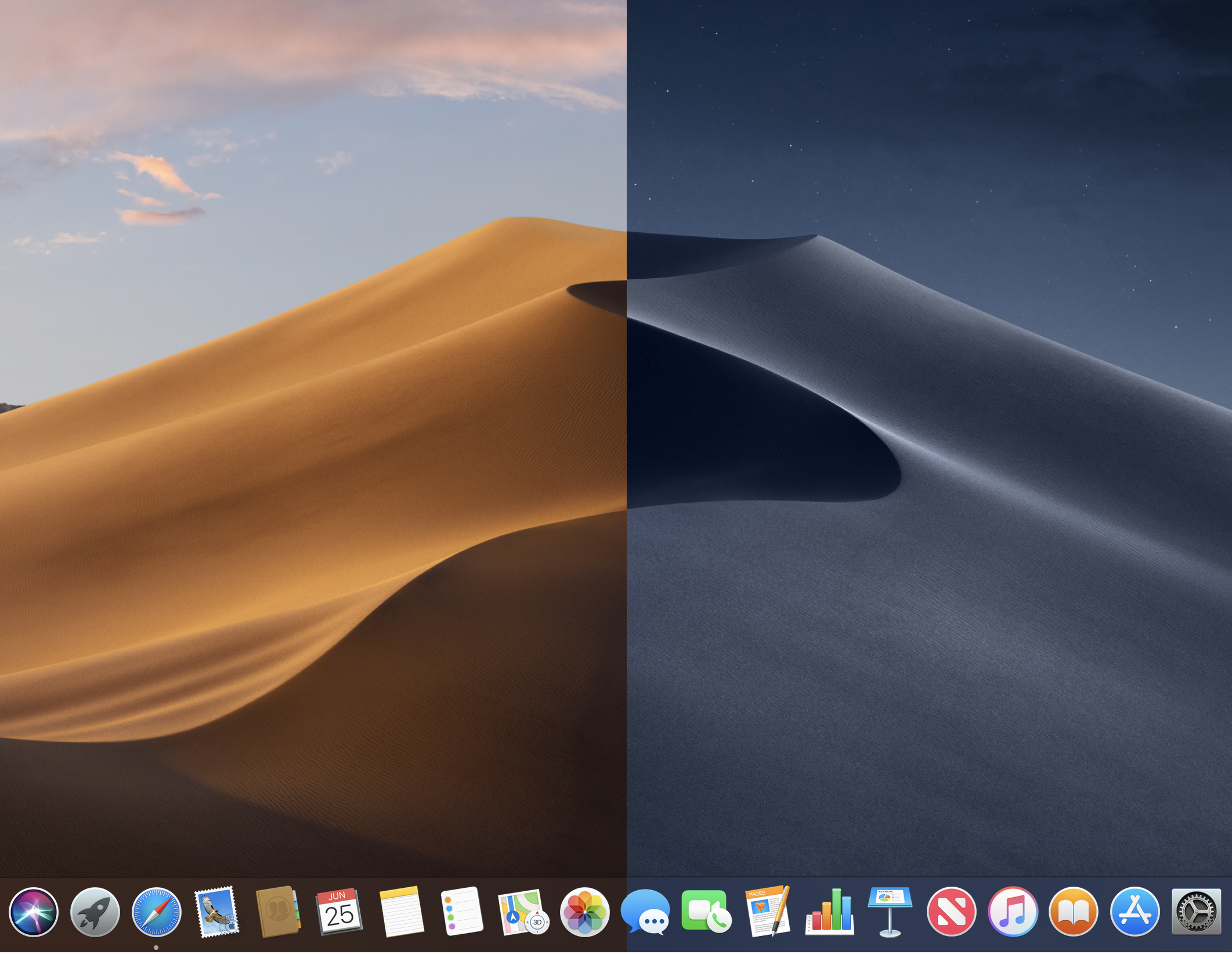
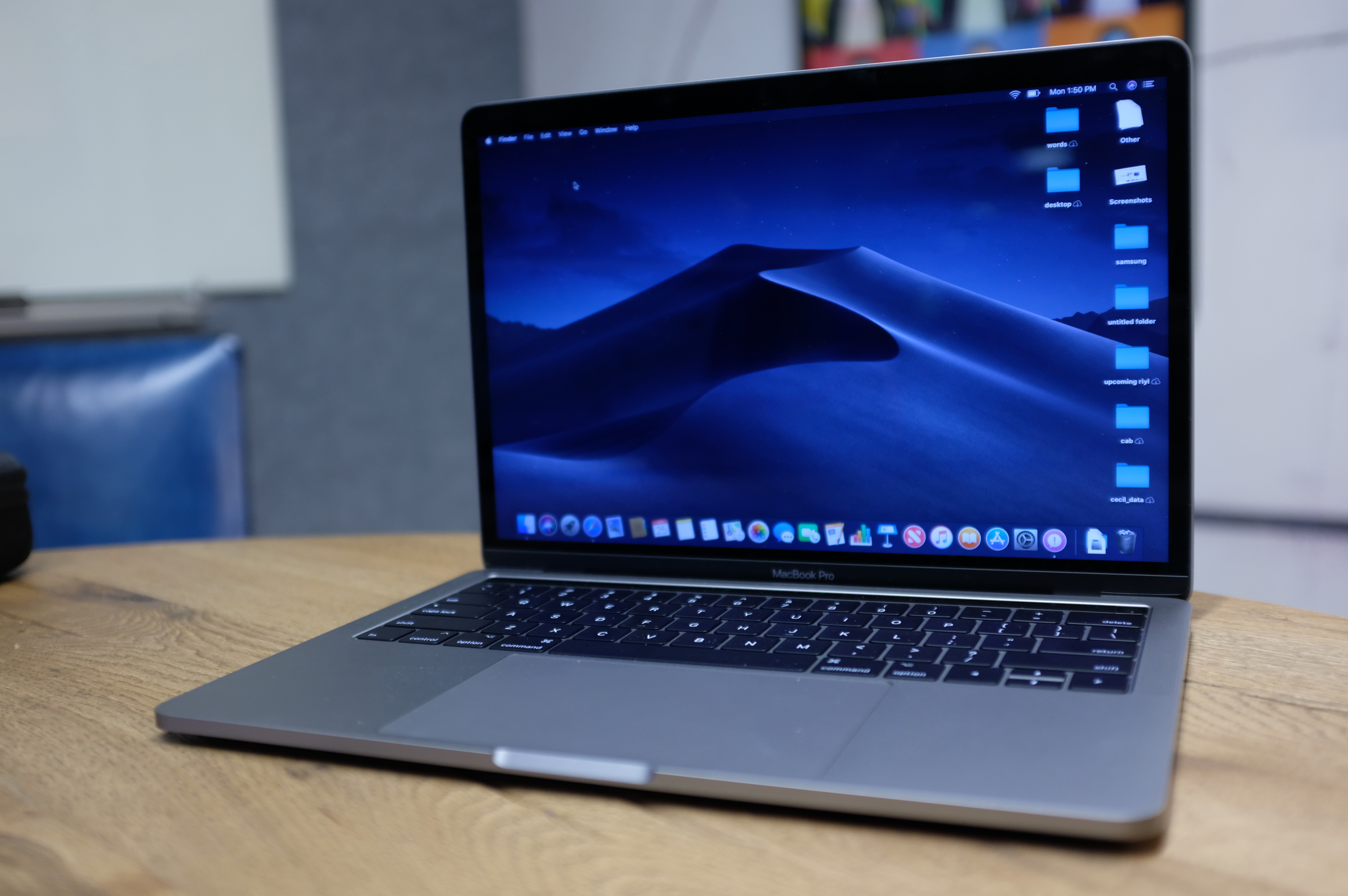
Apple’s done a good job here maintaining consistency across its own apps. Along with darkened menus and frames, Mail, Contacts and Calendar invert to white text on a dark background. The default Mojave desktop image of a winding sand dune has also been transformed accordingly.

Better still, there’s a dynamic version of the wallpaper that will darken, based on the time of day, as the sun sets and stars come out in the desert sky. A nice touch. However, only the default wallpaper is capable of doing that at the moment. If you want the effect, I hope you don’t mind staring at sand.

The biggest issue with Dark Mode (in this admittedly still early public beta stage) is compatibility. Apple says that the mode is designed for easy adoption by third-party developers, assuming their apps are built for the macOS Mojave SDK, but there’s no guarantee the apps you use regularly will have that compatibility at launch. That means there’s a decent chance your dark desktop scheme will be regularly interrupted by a blast of white light.

This is also the case for Apple’s own apps like Safari (though iWork and other not preloaded Apple apps don’t yet have the functionality), which have implemented aspects of Dark Mode, but in which you’re going to be spending a lot of time looking at bright pages regardless.  For most of us who spend time in and out of various apps, Dark Mode’s actual functionality is pretty limited, but you’ll no doubt be compelled give it a go anyway. At the very least, it’s a nice departure from the default macOS color scheme you’ve been ensconced in for so long.

Stacks

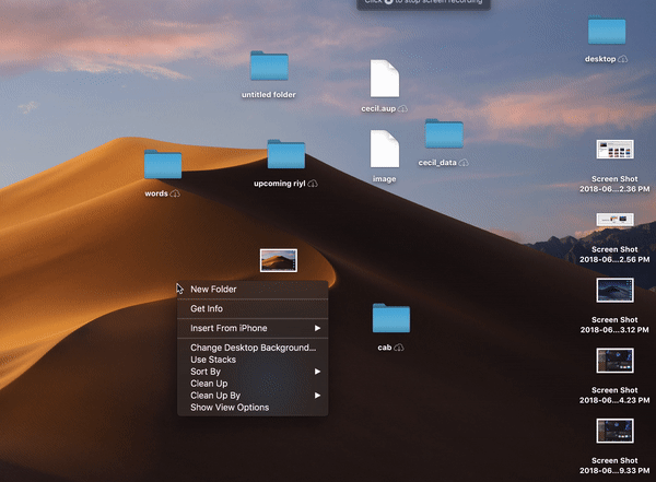
Dark Mode may be the feature that got the biggest crowd reaction at WWDC, but Stacks is the best. No question here, really, and this is coming from someone who’s gotten fairly consistent about tidying up his desktop. This thing is worthy of a clickbait-style “One Weird Trick to Organize Your Life” headline.

This is a surprisingly cathartic act. Hover over the wallpaper of your out of control desktop, two-finger tap the touchpad and select “Use Stacks” from the drop-down. Poof, they all shoot into their pre-ordained piles on the right. The default mode categorizes files by product type, which is probably the most straightforward method of the bunch (you also can switch to category or tag). If a file is the only one of its kind on the desktop, it will maintain its name below the thumbnail; otherwise, the file kind will show off below. Unclassified files will show up in a less helpful “other” Stack.

When new files are added to the desktop, they automatically appear in their associated pile, so long as you stay in Stacks mode. When the mode is enabled, files are essentially stuck to these spots like a grid. You can drag and drop them into apps, but can’t move them around the desktop.

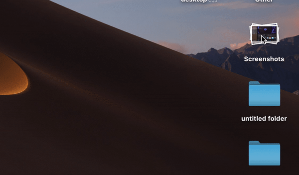
Once everything is sorted, clicking on the top of the stack will spread it out so you can once again view everything all once. Click the top of the pile again, and poof, everything goes back into the pile. You also can hover over the top with the cursor and swipe the trackpad left or right with two fingers to scrub through the list. I find the method a bit less useful, but some will no doubt prefer it.

If you decide the whole cleanliness thing isn’t for you, two-finger tap the wallpaper again. Click “Use Stacks” and poof, everything gets sent back to its original entropic position on the desktop. Good on Apple for letting users revert back to the madness.

Apple’s added a LOT of different features — from Launchpad to Tags — designed to help users get better organized. For my part, I’ve largely tried and failed to incorporate them into my daily usage. Stacks, on the other hand, is a genuinely useful addition and a strong contender for the most useful feature Apple has brought to macOS in recent memory.

Desktop

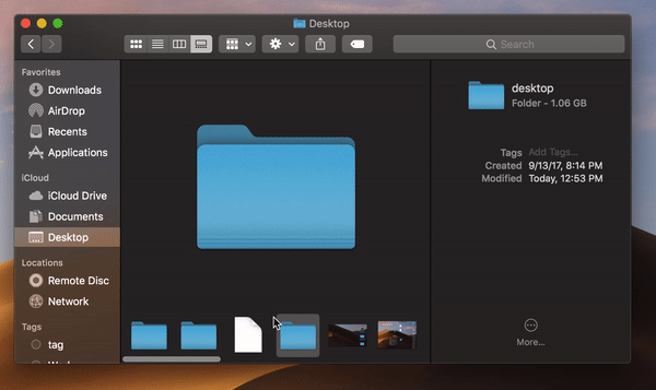
Gallery View is an interesting addition for similar reasons as Dark Mode. The feature is a spiritual successor to the familiar Cover Flow. It’s less dynamic, relying on a bottom scroll bar, rather than large images up top. It puts meta data front and center much more than before. This is especially apparent when dealing with images, giving you an almost light-room level of detail on photos.

The information includes, but is not limited to: dimensions, resolution, color space, color profile, device make, device model, aperture value, exposure time, focal length, ISO speed, flash, F number, metering mode and white balance. It’s lot for most users. In fact, it’s probably overkill for a majority of us, but it’s clearly another indication that Apple’s working to maintain its hold on the creative professional category by building that intense level of detail directly into the Finder.

Tucked down in the bottom-right corner of Finder windows are Quick Actions. There are a handful of handy features for editing images and PDF docs, including Rotate Left (as found in the iOS Photos app), markup (as found in Adobe Acrobat), Add Password and Create PDF, which turns files into PDFs, as advertised.

It’s an interesting system-level embrace of Adobe’s file format, and also makes the need for Preview somewhat redundant, as it’s baked directly into Finder. The options are dependent on file type — so, if you have, say, an audio or video file, you can trim it directly in the Finder window. For most tasks, you’ll probably want to open an editing app, but I would love to see more personalized actions down here. For my own needs, something like file cropping and resizing would be great to have built directly into the Finder window, saving me a trip to Photoshop or some online editing tool. I realize my needs aren’t the same as everyone’s — but all the more reason to offer some manner of customization down there, akin to what Apple offers with the MacBook Touch Bar.

Screenshots

File previews are getting a lot of love here, throughout. I’m not sure how often normal people use screenshots, but I take them all the damn time, so any addition here is welcome. Beyond general usefulness, I suspect a lot of people simply don’t take screenshots because the key command is fairly convoluting. Shift-Command-5 isn’t exactly easier to remember than other, similar combinations, but it does bring up a hand control window overlay.

From there, you can choose to capture a full screen, a window, a selection you outline yourself, record a video of the entire screen (which I used for the above Stacks GIF) or record a video of a selection. It certainly saves from having to memorize all of the different commands. The new screenshots also make it possible to set a timer of five or 10 seconds before snapping a photo.

Apple’s taking a play from iOS, offering up a small window in the right-hand corner of the screen once the screenshot has been snapped. You can click directly into that, or just wait for it to disappear. From there, you can markup the file, drag and drop it it into a document or have it automatically sent to the desktop, documents, Mail, Messages, Preview or a Clipboard, so they don’t all wind up in the same spot.

Continuity Camera

Not sure how often this feature will actually prove handy for most users, but it’s a cool feature, nonetheless. Continuity Camera essentially uses an iPhone as a surrogate camera for the desktop. It’s a clever bit of cross device synergy.

Say you’re in Page. Go to Edit > Insert from Your iPhone and choose Photo. Take a shot, approve it on the device, and it will automatically insert itself in the doc. It works like a charm. The scan feature also works surprisingly well here. I took a shot of a crumpled receipt and it looked pretty pristine, regardless. As someone who recently went through a lengthy visa process, I wish I’d had access to this thing a few weeks back.

FaceTime

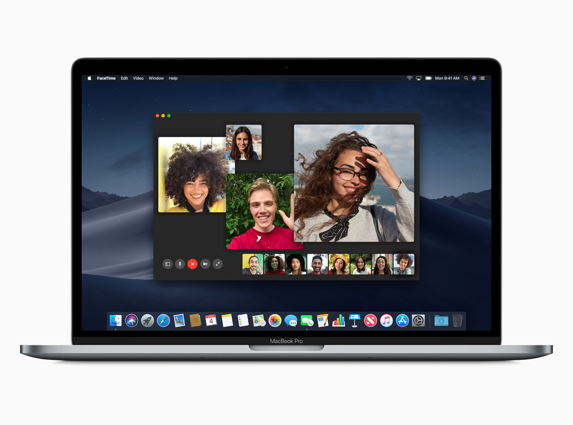
This one definitely wowed the crowd. FaceTime’s macOS/iOS-only is the main thing that’s hampered my own use of the service, but there are some really nice additions here that are making me rethink the decision. The ability to add up to 32 users is far and away the most fascinating, and Apple’s done a good job managing that kind of unruly number.

Similar to services like Google Meet, the system automatically detects who’s speaking and places them front and center in the app. Also like Meet, you can manually prioritize the users on whom you’d like to focus.

Other users will shrink down and eventually populate the carousel at the bottom. You can get the list of participants by clicking the Info button. And invitations for more users can be extended while the chat is in progress.

iOS apps

Apple made a point of addressing longtime rumors of a convergence between the company’s desktop and mobile operating systems, flashing a giant “No” onstage. That said, the two OSes are getting even more shared DNA. The biggest news on this front is the porting of three iOS apps to the Mac. This is clearly the first step toward a larger convergence of some kind, but more to the point, it’s a way to start getting app developers to port their iOS apps to the desktop.

Sure, macOS had a huge head start, but iOS has been getting all of the developer love in recent years. Making it easier to create apps cross-system means devs don’t have to decide. It also means that the app that come to macOS through this method will be more likely to do so through the Mac App Store — a distribution method Apple clearly prefers over more traditional downloads, for myriad reasons.

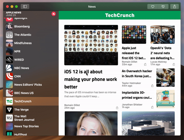
To start, Apple has brought over News, Stocks, Voice Memos and Home. In my time with Mojave thus far, News is the one I now use pretty regularly. I was a bit hesitant to move to a more walled approach to news delivery, but I do appreciate having a centralize hub of the trusted news sources I visit regularly, coupled with alerts that populate the Notification Center at right.

It’s probably not going to replace my use of TweetDeck for work-related news, as, among other things, it just seems to update more slowly. But it’s a nice tool to have churning in the background, along with a check-in once or twice a day, to make sure I haven’t missed a moment of the horror show that is news in 2018. Fun!

Voice Memos probably has the most limited scope of the bunch. I’ve switched over from various third-party tools I use to record meetings from time to time, and it’s nice having that sharing across devices. Students will likely find it handy for lectures as well, but beyond that, it’s probably not going to get a ton of play for most users.

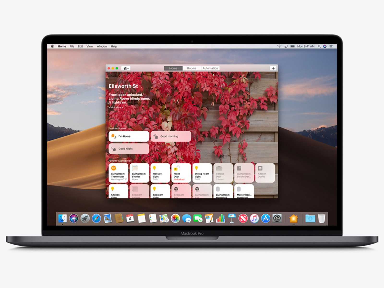
Home is the most interesting addition of the bunch. Certainly it makes sense, as Apple makes a bigger push to remain competitive against the likes of Amazon and Google in the smart home. The Mac isn’t designed to be a hub in this case — that’s still the job of Apple TV and HomePod, so far as the company is concerned. But the desktop OS does make for a nice control panel, and it’s handy to be able to check in on your place remotely from the comfort of your MacBook.

Given that they are, in fact, ports, not much has changed from a design standpoint. That means it’s essentially the same layout as the one you’ll get on your iPad, with a grid of tidy little boxes representing your various connected home devices. It’s pretty hard to shake the compulsion to reach out and touch the things. Apple, of course, has taken a hard-line against incorporating touch into its laptops and desktops, so reaching out won’t get you very far in this particular case.

Odds and ends

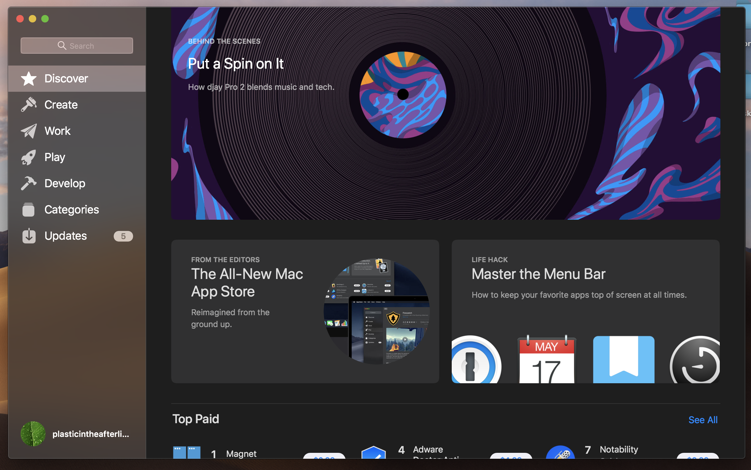
  • The Mac App Store gets an overhaul here, including search filtering and new content categories. Apple’s also added the kind of editorial curation it’s had on iOS and other apps.
  • More privacy permissions is always a good thing. In addition to the standard access to Contacts, Calendar Photos and Reminders, Apple’s added notifications for apps accessing the camera, mic and sensitive data. That means more pop-ups to click through, but more importantly, some extra peace of mind.
  • The system now does “password auditing,” to make sure you don’t reuse the same passwords over and over again.
  • Siri gets a couple of additions on the desktop here, including the ability to add passwords with voice.


from Apple – TechCrunch https://ift.tt/2MrDT1Y

The new Google Maps with personalized recommendations is now live

At its I/O developer conference last month, Google previewed a major update to Google Maps that promised to bring personalized restaurant recommendations and more to the company’s mapping tool. Today, many of these new features started rolling out to Google Maps users.

The core Google Maps experience for getting directions hasn’t changed, of course, but the app now features a new ‘explore’ tab that lets you learn more about what’s happening around you, as well as a ‘for you’ tab that provides you with recommendations for restaurants, lists of up and coming venues, and the ability to ‘follow’ neighborhoods and get updates when there are new restaurants and cafes that you would probably like. The main difference between the Explore and For You tabs is that the former is all about giving you recommendations for right now, while the latter is more about planning ahead and keeping tabs on an area in the long run.

While most of the other features are rolling out to all users worldwide, the new ‘for you’ tab and the content in it is only available in the U.S., U.K., Canada, Australia and Japan for now. Content in this tab is still a bit limited, too, but Google promises that it’ll ramp up content over the course of this week.

Both of the new tabs feature plenty of new features. There is the ‘foodie list,’ for example, which shows you the hottest new restaurants in an area. And if you feel completist, Google will keep track of which one of these places you’ve been to and which ones you still have to visit. Like before, the Explore tab also features automatically curated lists of good places to go to for lunch, with kids or for a romantic dinner. It’s not just about food and coffee (or tea), though, those lists also include other activities and Google Maps can now also highlight local events.

With this launch, Google is also releasing its new ‘Your Match’ scores, which assigns a numeric rating to each restaurant or bar, depending on your previous choices and ratings. The idea here is that while aggregate ratings are often useful, your individual taste often differs from the masses. With this new score, Google tries to account for this. To improve these recommendations, you can now also explicitly tell Maps which cuisines and restaurants you like.

It’s worth noting that there are still some features that Google promised at I/O that are not part of this release. Group planning, for example, which allows you to create a list of potential meet-up spots and lets your friends vote on them, is not part of this release.

[gallery ids="1663429,1663430,1663431"]

The updated Google Maps for iOS and Android is now available in the Play Store and App Store.

If you’d like to read more about Google’s rationale for many of these changes, also take a look at our in-depth interview with Sophia Lin, Google’s senior product manager on the Google Maps team, from I/O.


from Android – TechCrunch https://ift.tt/2KlKNZr
via IFTTT

Apple launches its free Schoolwork app for teachers

Apple this morning launched Schoolwork, a free app for teachers that was first introduced at Apple’s education event in Chicago back in March. The cloud-based app allows teachers using iPads in the classroom to create and distribute handouts and other assignments, collaborate individually with students, track students’ progress, and – perhaps most notably – allows teachers to assign specific activities within educational apps.

That means instead of pointing students to download an app and then give them instructions on how to access the individual task, teachers can instead guide students directly to a specific lesson with an app.

This lets schools tap into the power of Apple’s App Store ecosystem, which has benefitted from being a more curated, trusted experience, where many kids’ app publishers launch their new and updated apps first and/or keep larger catalogs.

Select educational apps already work with Schoolwork, including Explain Everything, Tynker, GeoGebra, and Kahoot!.

With this ability to assign in-app tasks, teachers can see how well the student is doing with the given assignment, not just their usage of the app overall. And they can also see how well the whole classroom is doing from their own dashboard, too.

Apple additionally emphasized the privacy elements to Schoolwork when it was first announced, and it reiterates them today.

Schools get to “create, own and control” the accounts used by students, says the company, and they get to determine when student progress information is shared.

Apple cannot see the student activity, either, as it stays within the system.

Privacy is a key selling point these days for Apple products. It could spur more adoption of its hardware and software devices in the classroom, even though its new $299 iPads for schools are higher priced than some of the low-end Chromebook options from Google that can range $100 to $150, for example.

The new iPads, along with software for digital book creation, Classroom for Mac, an updated Swift Playgrounds app, and other educational tools were also shown off at the Chicago event earlier this year.

Schoolwork is designed to work with the Classroom app, which now runs on both iPad and Mac.

The Classroom app lets teachers view students’ screen in class, share documents with students, assign shared iPads, and reset student passwords. Students, meanwhile, use Schoolwork to view the content teachers’ share – like announcements, handouts, documents, PDFs, and web links –  and track which of their assignments are due.

Apple’s efforts in education come at a time when Google is winning the market with its Chromebooks, which have a reported nearly 60 percent share in the classroom, according to estimates.

But Apple’s devices may appeal for other activities beyond word processing and web research – its iPads for the classroom, for example, support Apple Pencil, including within iWork, as well as Logitech’s $49 “crayon.” Teachers can create lightweight iPad-based texts using iPad Author, and kids can learn to create AR apps in Swift Playgrounds.

Teachers can learn more about Apple’s educational tools on its dedicated site here.


from Apple – TechCrunch https://ift.tt/2ly0gay

Monday, 25 June 2018

Get your trusted midterm elections news from us, says Apple

Apple News has a new old mission: Curating political news and analysis by paying a team of experienced human editors to quality-assess journalism, rather than letting unchecked algorithms run wild and exaggerate anything — no matter how awful, obnoxious or untrue.

‘Fakebook’ eat your heart out.

Apple says human curation is not a new direction for Apple News — describing it as a “guiding principle” across the product since it launched three years ago.

Although it certainly wasn’t shouting so loudly about it back then when algorithmic feeds were still riding high. But the company says Apple News has always had a team of editors — which it says are focused on “discovering and spotlighting well-sourced fact-based stories to provide readers with relevant, reliable news and information from a wide range of publishers”.

Those “experienced” editors are also now being put to work assessing political reportage and commentary around the US midterms. With only publishers they deem to be “reliable” getting to be political sources for Apple News.

The launch is focused on the US 2018 midterm elections, at least initially, which will get a dedicated section in the product — providing what Cupertino bills as “timely, trustworthy midterm election information” along with “the most important reporting and analysis from a diverse set of publishers”.

We’ve asked the company whether it plans to expand the Apple News election section approach to other markets.

“Today more than ever people want information from reliable sources, especially when it comes to making voting decisions,” said Lauren Kern, editor-in-chief of Apple News, in a statement. “An election is not just a contest; it should raise conversations and spark national discourse. By presenting quality news from trustworthy sources and curating a diverse range of opinions, Apple News aims to be a responsible steward of those conversations and help readers understand the candidates and the issues.”

Apple is clearly keen to avoid accusations of political bias — hence stressing the section will include a “diverse range of opinions”, with content being sourced from the likes of Fox News, Vox, the Washington Post, Politico and Axios, plus other unnamed publishers.

Though there will equally clearly be portions of the political spectrum who decry Apple News’ political output as biased against them — and thus akin to political censorship.

Safe to say, don’t expect Breitbart to be a fan. But as any journalist worth their salt will tell you, you can’t please all the people all of the time. And not trying to do so is essentially a founding tenet of the profession. It’s also why algorithms suck at being editors.

The launch of a dedicated section for an election event within Apple’s news product is clearly a response to major failures where tech platforms have intersected with political events — at least where business models rely on fencing content at vast scale and thus favor algorithmic curation (with all the resulting clickbaity, democracy-eroding pitfalls that flow from that).

Concern about algorithmic impacts on democratic processes continues to preoccupy politicians and regulators in the US and beyond. And while it’s fair to say that multiple tech platforms have a fake news and political polarization problem, Facebook has been carrying the biggest can here, given how extensively Kremlin agents owned its platform during the 2016 US presidential elections.

Since then the company has announced a raft of changes intended to combat this type of content — including systems to verify political advertisers; working with third party fact checkers; closing scores of suspect accounts around elections; and de-emphasizing news generally in its News Feed in favor of friends’ based updates which are harder for malicious agents to game at scale.

But its core algorithmic approach to programming the hierarchies of content on its platform has not changed.

And while it’s ramping up the number of content moderation and safety staff on its books — saying it will have 20,000 people working on that by the end of this year — that’s still reactive content assessment; which is the polar opposite of editorial selection and curation.

So Apple evidently sees an opportunity for its News product to step in and fill the trust gap with reliable political information.

As well as general news and commentary from the selected trusted publishers, Apple says it will also include “special features with stories curated by Apple News editors from trusted publishers”, including opinion columns “about hot-button issues that are intended to offer readers a full range of ideas and debate about important subjects, from news sources they may not already follow” (so it’s also taking aim at algorithmically generated filter bubbles); and an election dashboard from the Washington Post — which contextualizes “key data like current polling, what pundits are saying and survey data on voter enthusiasm”.

Local news is another focus for the section, with a feature that aims to highlight “quality reporting about issues that matter to local constituents on the most important races”.

The 2018 Midterm Elections section is available to Apple News users in the US from now until November.


from Apple – TechCrunch https://ift.tt/2tBRlbJ

Anker Mars II projector promises solid summer fun

Anker, a popular if battery and cable company, recently announced the Mars II projector under its Nebula brand. The company, which primarily sells via Amazon, is expanding out of batteries and cables and is now creating audio and other portable AV gear. This compact, battery-powered DLP projector is their latest creation and it has found a place of honor at our family barbecues.

The projector is actually an Android 7.1 device stuffed into a case about as big as a Bluetooth speaker. A physical lens cap slides down and turns on the system and you control everything from he included remote or the buttons on the top of the device. You can also download an app that mimics a mouse and keyboard for choosing videos and information entry. It projects at a maximum of 300 lumens and projects at 720p. You can also connect an HDMI device like a game console or stick in a USB drive full of videos to view on the fly.

Again, the real benefit here is the ability to stream from various apps. I have YouTube, Netflix, Plex, and other apps installed and you can install almost any other Android app you can imagine. It has speakers built in and you can cast to it via Miracast but you cannot insert a Chromecast.

If all you want to do is throw up a little Santa Clarita Diet or Ice Age on a sheet in the back yard, this thing is perfect. Because the brightness is fairly low you need solid twilight or a partially dark room to get a good picture. However, the picture is good enough and it would also make a great presentation device for a closed, dark conference room. Because of its small size and battery life – four hours on a charge – it makes for a great alternative to a full-sized projector or even a standard TV.

At $539 the Mars II is priced on par with other 720p projectors. The primary use case – connecting a computer or console via HDMI – works quite well but streaming user experience is a bit of a mixed bag. Because Anker didn’t modify the Android installation much further than adding a few default apps, some apps require a mouse to use and others can be controlled via the arrow keys on the remote or body of the device. This means that some apps – like Plex, for example – let you pick a video via the arrow keys but require you to press the “mouse” button to begin simulating a mouse cursor on the screen. It’s a bit frustrating, especially in poor lighting conditions.

One of the interesting features is the automatic focus system. Instead of fiddling with a knob or slider, you simply point this at a surface and the system projects a bullseye focus ring until the picture is in focus. The focus changes any time you move the device and sometimes it gets caught up if the screen or projector are moving. However in most cases it works perfectly fine.

Like most portable projectors you aren’t buying the Mars II to watch 4K video in 5.1 surround sound. You buy it to offer an alternative to sitting on the couch and watching a movie. That means this is great for on-the-road business presentations, campouts, outdoor movie viewing, and sleepovers. It is cheap and portable enough to be almost disposable and it’s not as heavy and hot as other, larger devices. In short, it can go anywhere, show anything, and works really well. Anker also makes the Mars, a more expensive 1080p device, but this one works just fine for about $400 less – a big drop in just about a year of brisk sales. It’s nice to see a good, low-cost manufacturer dabble in the world of complex consumer electronics and come up with a product that is truly useful and fun.

[gallery ids="1662668,1662666,1662665,1662662,1662661"]

from Android – TechCrunch https://ift.tt/2KmzZH4
via IFTTT

Apple reportedly working on next-gen, water-resistant AirPods

Apple is reportedly working on a new, likely more expensive, set of AirPods with noise-cancellation, according to Bloomberg.

The report cites people familiar with the matter, who said that Apple is exploring making the AirPods water resistant. That said, you still don’t want to go swimming with these things, as the rumored water resistant AirPods would be more likely to only stand up against perspiration and rain rather than being submerged.

Bloomberg said that one source suggested Apple could add biometric sensors to the next-gen AirPods, furthering the company’s health tracking efforts. Sources also say that the updated AirPods would come with a new case that is compatible with the Apple’s new wireless charging pad.

As it stands now, AirPods cost $159 in the U.S. The new, rumored pair of in-ear wireless headphones will likely cost more, allowing Apple to price AirPods the same way it prices iPhones, offering a more expensive high-end model and a low-end model like the iPhone SE.

This news comes in the middle of a big year for Apple’s auditory efforts.

On the one hand, Apple’s Amazon Echo competitor, the HomePod, was delayed quite a bit following its announcement. Bloomberg says Cupertino is already hard at work developing a new model.

Apple is also reportedly working on over-the-ear headphones. The headphones would be Apple-branded, and would be on the higher-end of the spectrum with Boze and Sennheiser. The company already sells over-the-ear headphones via Beats, which Apple acquired in 2014 for $3 billion.


from Apple – TechCrunch https://ift.tt/2lzwBy0