Thursday, 28 June 2018

Disney Imagineering has created autonomous robot stunt doubles

For over 50 years, Disneyland and its sister parks have been a showcase for increasingly technically proficient versions of its “animatronic” characters. First pneumatic and hydraulic and more recently fully electronic — these figures create a feeling of life and emotion inside rides and attractions, in shows and, increasingly, in interactive ways throughout the parks.

The machines they’re creating are becoming more active and mobile in order to better represent the wildly physical nature of the characters they portray within the expanding Disney universe. And a recent addition to the pantheon could change the way that characters move throughout the parks and influence how we think about mobile robots at large.

I wrote recently about the new tack Disney was taking with self-contained characters that felt more flexible, interactive and, well, alive than ‘static’, pre-programmed animatronics. That has done a lot to add to the convincing nature of what is essentially a very limited robot.

Traditionally, most animatronic figures cannot move from where they sit or stand, and are pre-built to exacting show specifications. The design and programming phases of the show are closely related, so that the hero characters are efficient and durable enough to run hundreds of times a day, every day, for years.

The Na’avi Shaman from Pandora: The World of Avatar, at Walt Disney World, represents the state of the art of this kind of figure.

However, with the expanded universe of Disney properties including more and more dynamic and heroic figures by the year, it makes sense that they’d want to explore ways of making the robots that represent those properties in the parks more believable and active.

That’s where the Stuntronics project comes in. Built out of a research experiment called Stickman, which we covered a few months ago, Stuntronics are autonomous, self-correcting aerial performers that make on-the-go corrections to nail high-flying stunts every time. Basically robotic stuntpeople, hence the name.

I spoke to Tony Dohi, Principle R&D Imagineer and Morgan Pope, Associate Research Scientist at Disney, about the project.

“So what this is about is the realization we came to after seeing where our characters are going on screen,” says Dohi, “whether they be Star Wars characters, or Pixar characters, or Marvel characters or our own animation characters, is that they’re they’re doing all these things that are really, really active. And so that becomes the expectation our park guests have that our characters are doing all these things on screen — but when it comes to our attractions, what are our animatronic figures doing? We realized we have kind of a disconnect here.”

So they came up with the concept of a stunt double for the ‘hero’ animatronic figures that could take their place within a show or scene to perform more aggressive maneuvering, much in the same way a double replaces a valuable and delicate actor in a dangerous scene.

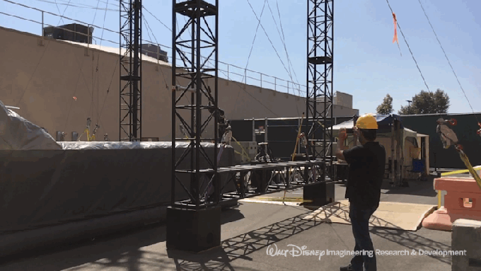
The Stuntronics robot features on-board accelerometer and gyroscope arrays supported by laser range finding. In its current form, it’s humanoid, taking on the size and shape of a performer that could easily be imagined clothed in the costume of, say, one of The Incredibles, or someone on the Marvel roster. The bot is able to be slung from the end of a wire to fly through the air, controlling its pose, rotation and center of mass to not only land aerial tricks correctly but to do them on target while holding heroic poses in midair.

One use of this could be mid-show in an attraction. For relatively static shots, hero animatronics like the Shaman or new figures Imagineering is constantly working on could provide nuanced performances of face and figure. Then, a transition to a scene that requires dramatic, un-fettered action and boom, a Stuntronics double could fly across the space on its own, calculating trajectories and striking poses with its on-board hardware, hitting a target dead on every time. Queue re-set for the next audience.

This focus on creating scenarios where animatronics feel more ‘real’ and dynamic is at work in other areas of Imagineering as well, with autonomous rolling robots and — some day — the holy grail of bipedal walking robots. But Stuntronics fills one specific gap in the repertoire of a standard Animatronic figure — the ability to convince you it can be a being of action and dynamism.

“So often our robots are in the uncanny valley where you got a lot of function, but it still doesn’t look quite right. And I think here the opposite is true,” says Pope. “When you’re flying through the air, you can have a little bit of function and you can produce a lot of stuff that looks pretty good, because of this really neat physics opportunity — you’ve got these beautiful kinds of parabolas and sine waves that just kind of fall out of rotating and spinning through the air in ways that are hard for people to predict, but that look fantastic.”
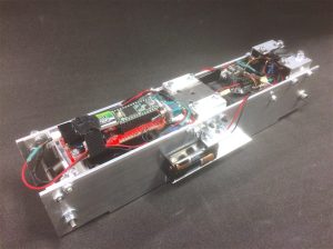
The original BRICK

Like many of the solutions Imagineering comes up with for its problems, Stuntronics started out as a research project without a real purpose. In this case, it was called BRICK (Binary Robotic Inertially Controlled bricK). Basically, a metal brick with sensors and the ability to change its center of mass to control its spin to hit a precise orientation at a precise height – to ‘stick the landing’ every time.

From the initial BRICK, Disney moved on to Stickman, an articulated version of the device that could now more aggressively control the rotation and orientation of the device. Combined with some laser rangefinders you had the bones of something that, if you squint, could emulate a ‘human’ acrobat.

“Morgan, I got together and said, maybe there’s something here, we’re not really be sure. But let’s poke at it in a bunch of different directions and see what comes out of it,” says Dohi.

But the Stickman didn’t stick for long.

“When we did the BRICK, I thought that was pretty cool,” says Pope. “And then by the time I was presenting the BRICK at a conference, Tony [Dohi] had helped us make stick man. And I was like, well, this isn’t cool anymore. The Stickman is what’s really cool. And then I was down in Australia presenting Stickman and I knew we were doing the full Stuntronic back at R&D. And I was like, well, this isn’t cool anymore,” he jokes.

“But it has been so much fun. Every step of the way I think oh, this is blowing my mind. but,they just keep pushing…so it’s nice to have that challenge.”

This process has always been one of the fascinating things to me about the way that Imagineering works as a whole. You have people that are enabled by management and internal structure to spool out the threads of a problem, even though you’re not really sure what’s going to come out of it. The biggest companies on the planet have similar R&D departments in place — though the ones that make a habit of disconnecting them from a balance sheet, like Apple, are few and far in between, in my experience. Typically, so much of R&D is tied to a profit/loss spreadsheet so tightly that it’s really, really difficult to sussurate something enough to see what comes of it.

The ability to kind of have vastly different specialities like math, physics, art and design to be able to put ideas on the table and sift through them and say hey, we have this storytelling problem on one hand and this research project on the other. If we drill down on this a bit more — would this serve the purpose? As long as the storytelling always remains the North Star then you end up having a a guiding light to serve drag you through the pile and you come out the other end, holding a couple of things that could be coupled to solve a problem.

“We’re set up to do the really high risk stuff that you don’t know is going to be successful or not, because you don’t know if there’s going to be a direct application of what you’re doing,” says Dohi. “But you just have a hunch that there might be something there, and they give us a long leash, and they let us explore the possibilities and the space around just an idea, which is really quite a privilege. It’s one of the reasons why I love this place.”

This process of play and iteration and pursuit of a goal of storytelling pops up again and again with Imagineering. It’s really a cluster of very smart people across a broad spectrum of disciplines that are governed by a central nervous system of leaders like Jon Snoddy, the head of R&D at the studios, who help to connect the dots between the research side and the other areas of Imagineering that deal with the Parks or interactive projects or the digital division.

There’s an economy and lack of ego to the organization that enables exploration without wastefulness and organically curtails the pursuit of things not in service to the story. In my time exploring the workings of Imagineering I’ve often found that there is a significant disconnect between how fascinating the process is and how well the organization communicates the cleverness of its solutions.

The Disney Research white papers are certainly infinitely fascinating to people interested in emerging tech, but the points of integration between the research and the practical applications in the parks often remain unexplored. Still, they’re getting better at understanding when they’ve really got something they feel is killer and thinking about better ways to communicate that to the world.

Indeed, near the end of our conversation, Dohi says he’s come up with a solid sound byte and I have him give me his best pitch.

“One of our goals of Stuntronics is to see if we can leap across the uncanny valley.”

Not bad.


from Apple – TechCrunch https://ift.tt/2Kf37nH

Apple could bundle TV, music and news in a single subscription

According to a report from The Information, Apple could choose to bundle all its media offerings into a single subscription. While Apple’s main media subscription product is currently Apple Music, it’s no secret that the company is investing in other areas.

In particular, Apple has bought the distribution rights of many TV shows. But nobody knows how Apple plans to sell those TV shows. For instance, you could imagine paying a monthly fee to access Apple’s content in the TV app on your iPhone, iPad and Apple TV.

In addition to that, Apple acquired Texture back in March. Texture lets you download and read dozens of magazines with a single subscription. The company has partnered with Condé Nast, Hearst, Meredith, News Corp., Rogers Communications, and Time Inc. to access their catalog of magazines

Texture is still available, but it’s clear that Apple has bigger plans. In addition to reformatting and redistributing web content in the Apple News app, the company could add paid content from magazines.

Instead of creating three different subscriptions (with potential discounts if you subscribe to multiple services), The Information believes that Apple is going to create a unified subscription. It’s going to work a bit like Amazon Prime, but without the package deliveries.

For a single monthly or annual fee, you’ll be able to access Apple Music, Apple TV’s premium content and Apple News’ premium content.

Even if you don’t consume everything in the subscription, users could see it as a good value, which could reduce attrition.

With good retention rates and such a wide appeal, it could help Apple’s bottom line now that iPhone unit sales are only growing by 0.5 percent year over year. It’s still unclear when Apple plans to launch its TV and news offerings.


from Apple – TechCrunch https://ift.tt/2yR85Sj

Apple buries the hatchet with Samsung but could tap LG displays

After years of legal procedures, Apple and Samsung have reached an agreement in the infamous patent case. Terms of the settlement were undisclosed. So is everything clear between Samsung and Apple? Not so fast, as Bloomberg reports that Apple wants to use OLED displays from LG to reduce its dependence on Samsung.

You might remember that Apple first sued Samsung for copying the design of the iPhone with early Samsung Galaxy phones. The first trial led to an Apple victory. Samsung had to pay $1 billion.

But the U.S. Patent and Trademark Office later invalidated one of Apple’s patents. It led to multiple retrials and appeals, and the Supreme Court even had to rule at some point.

After many years, Samsung ended up owing $539 million to Apple. According to Reuters, Samsung has already paid $399 million.

If you look closely at the original case, it feels like it happened many decades ago. At some point, the Samsung Galaxy S 4G, the Nexus S and a few other devices looked a lot like the iPhone 3G.

But now, it’s hard to say that Samsung is copying Apple. For instance, Samsung is one of the only phone manufacturers that hasn’t switched to a notch design. The Samsung Galaxy S9 and the rest of the product lineup still features a rectangular display . Huawei, LG, OnePlus, Asus and countless of others sell devices with a notch.

That could be the reason why it seems weird to spend all this money on legal fees for things that are no longer true.

And yet, the irony is that Apple and Samsung are the perfect example of asymmetric competition. They both sell smartphones, laptops and other electronics devices. But they also work together on various projects.

In particular, the iPhone X is the first iPhone with an OLED display. It’s a better display technology compared to traditional LCD displays. It’s also one of the most expensive components of the iPhone X.

According to Bloomberg, Apple wants to find a second supplier to drive component prices down. And that second supplier is LG.

LG already manufactures OLED displays. But it’s difficult to meet Apple’s demands when it comes to the iPhone. Apple sells tens of millions of smartphones every year. So you need to have a great supply chain to be able to become an Apple supplier. LG could be ramping up its production capacity for future iPhone models.

According to multiple rumors, Apple plans to ship an updated iPhone X with an OLED display as well as a bigger iPhone. The company could also introduce another phone with an edge-to-edge LCD display with a notch and a cheaper price.

There’s one thing for sure, it’ll take time to switch the entire iPhone lineup to OLED displays.


from Apple – TechCrunch https://ift.tt/2KvZ1nc

LiDAR startup Luminar hires former Fitbit and Apple execs

LiDAR company Luminar and its whiz founder Austin Russell burst onto the autonomous vehicle startup scene last April after operating for years in secrecy. Now, Luminar has nabbed two high-profile hires that signal its grander ambitions in the race to develop and deploy autonomous vehicles.

Luminar announced Thursday it has hired Fitbit executive Bill Zerella as its chief financial officer and Tami Rosen as chief people officer. Both have years of experience in their respective arenas. Zerella was CFO of FitBit for four years. He has held the CFO position in various other companies, including wireless communications company Vocera, Force10 Networks, and telecom equipment firm Infinera.

His specialty is helping burgeoning startups scale up in revenue as well as operationally to hit high-volumes hardware and software products. He has also helped companies navigate the path to an IPO. During his stint at Fitbit, Zerella led the largest consumer electronics IPO in history.

Rosen also has a long and fruitful HR career, including 16 years at Goldman Sachs and a  role senior director of human resources at Apple. She was most recently vice president of people at Quora.

Rosen will need to rely on her deep experience. The explosion of companies working on autonomous vehicle technology has firms competing for a limited pool of talent. HR will be a keystone to Luminar’s plans to scale, and to the broader transformation of the future of transportation, Rosen told TechCrunch.

“It really takes looking at how you build a strong culture, one that’s inclusive and motivates the workforce and that can be key for us to hit these ambitious goals,” Rosen said.

LiDAR, or light detection and ranging radar, measures distance using laser light to generate a highly accurate 3D map of the world around the car. LiDAR is considered by many automakers and tech companies an essential piece of technology to safely roll out self-driving cars.

Russell has argued that companies have been wrongly focused on the price and should instead work on LiDAR’s performance. That’s where Luminar started.

The company built its LiDAR from scratch, a lengthy process that resulted in a simpler design and better performance. Now the company is working on reducing the cost through its own smart engineering and good old-fashioned economies of scale.

That’s where Zerella and Rosen come in. Russell has built out the tech, grown the company to about 400 employees over three locations, made a strategic acquisition of Black Forest Engineering, and landed partnerships with Toyota Research Institute and most recently Volvo. Luminar also has 136,000-square-foot manufacturing center in Orlando, Florida.

Zerella and Rosen aim to take Luminar further.

“Last year it was all about demonstrating how the technology was coming together, adopting some of these initial commercial partners, building out the production facility,” Russell told TechCrunch in an interview ahead of the announcement. “Now it all comes down to execution and scale.”


from Apple – TechCrunch https://ift.tt/2tMkBwD

India’s Times Internet buys popular video app MX Player for $140M to get into streaming

Times Internet, the digital arm of Indian media firm Times Group, is getting into the digital content space, but not in the way you might think.

The company’s previous venture — an OTT called BoxTV.com — shut down in 2016 after an underwhelming four-year period. Now it is taking a radically different strategy by buying video playback app MX Player for Rs 1,000 crore, or around $140 million. The company didn’t disclose its stake but said it is a majority percentage.

The service originates from Korea but it has become hugely popular in India as a way to play media files, for example from an SD card, on a mobile device. It is a huge hit India, where the app claims 175 million monthly users — while the country accounts for 350 million of its 500 million downloads.

From here, Times Internet plans to introduce a streaming content service to MX Player users which Karan Bedi, MX Player CEO, expects to go live before August. The plan is to introduce at least 20 original shows and more 50,000 content across multiple local languages in India during the first year. The duo said the lion’s share of that investment money would go into developing content.

Bedi, a long-time media executive who took the job at MX Player eight months ago, said the service will be freemium and very much targeted at the idea of providing an alternative to television in India. He added that the deal had been in negotiation for the past year, which validates a January report from The Ken which first broke news of acquisition.

There are plenty of video streaming services in India. Beyond Netflix and Amazon Prime, Hotstar (from Rupert Murdoch-owned Star India) is making waves alongside Jio TV from Reliance Jio, but data from App Annie suggests MX Player is way out ahead. The analytics firm pegs MX Player at nearly 50 million daily users, as of June, well ahead of Hotstar (14.1 million), JioTV (7.4 million) and others.

Both Bedi and Times Internet MD Satyan Gajwani explained to TechCrunch in an interview that a big focus is differentiation and building a digital channel for India’s young since the average viewer demographics for MX player are hugely different to Indian TV audiences. Some 80 percent of the app’s users are aged under 35 (70 percent is aged under 25), while the gender balance is skewed more towards men.

“A lot of people aren’t happy with Indian TV,” Bedi said. “There are a lot is soaps and it is not focused on young people. [The MX PLayer audience] is exactly the opposite of the Indian tv demographic.”

That not only plays into growing a place for ‘millennial’ content, but it also means the streaming service may find success with advertisers if it can offer a gateway to young Indians. Beyond audience, there’s also flexibility. Gajwani explained further that unlike traditional TV and even YouTube, the Times Internet-MX Player service will offer different options for advertisers who “work with content creators to create stuff, sponsor a show, or find various different ways to reach scale.”

“India has a $6 billion TV ad market and we think this could unlock some of the money going to TV,” he said.

Times Internet MD Satyan Gajwani

“This audience on here is genuinely different, [rather than cord-cuttters] they’re almost cord-nevers,” Bedi added. “This is a big new audience that’s never been tapped by broadcasters.”

The idea is to gently introduce programming that is accessible to a large audience in India, who might not be open to paying, and then test other revenue models later.

“Further down the line, we might include subscriptions to scale,” Gajwani added. “Subscription is growing but it’s much much smaller today, what excites us is the idea we’ll have 100 million people streaming a show.”

MX Player might not be well known, but scale is one thing it certainly has in spades. The company just crossed 500 million downloads on Android, but Bedi pointed out that many are not counted because they are side-loaded, which doesn’t register with the Google Play Store.

All told, he said, the app picks up 1.2 million downloads per day with around 350,000 coming from the official Android app store, he said. Bedi said that, among other things, the app is typically distributed by smartphone vendors in tier-two and three Indian cities to help phone buyers get the essential apps for their device right away.

The question now is whether Times Internet can leverage that organic growth to build another business on top of the basic demand for video playback. This is certainly a unique approach.


from Android – TechCrunch https://ift.tt/2yRtYkA
via IFTTT

Wednesday, 27 June 2018

The Sonos Beam is the soundbar evolved

Sonos has always gone its own way. The speaker manufacturer dedicated itself to network-connected speakers before there were home networks and they sold a tablet-like remote control before there were tablets. Their surround sound systems install quickly and run seamlessly. You can buy a few speakers, tap a few buttons, and have 5.1 sound in less time than it takes to pull a traditional home audio system out of its shipping box.

This latest model is an addition to the Sonos line and is sold alongside the Playbase – a lumpen soundbar designed to sit directly underneath TVs not attached to the wall – and the Playbar, a traditionally-styled soundbar that preceded the Beam. Both products had all of the Sonos highlights – great sound, amazing interfaces, and easy setup – but the Base had too much surface area for more elegant installations and the Bar was too long while still sporting an aesthetic that harkened back to 2008 Crutchfield catalogs.

The $399 Beam is Sonos’ answer to that and it is more than just a pretty box. The speaker includes Alexa – and promised Google Assistant support – and it improves your TV sound immensely. Designed as an add-on to your current TV, it can stand alone or connect with the Sonos subwoofer and a few satellite surround speakers for a true surround sound experience. It truly shines alone, however, thanks to its small size and more than acceptable audio range.

To use the Beam you bring up an iOS or Android app to display your Spotify, Apple Music, Amazon, and Pandora accounts (this is a small sampling. Sonos supports more.) You select a song or playlist and start listening. Then, when you want to watch TV, the speaker automatically flips to TV mode – including speech enhancement features that actually work – when the TV is turned on. An included tuning system turns your phone into a scanner that improves the room audio automatically.

The range is limited by the Beam’s size and shape and there is very little natural bass coming out of this thing. However, in terms of range the Beam is just fine. It can play an action movie with a bit of thump and then go on to play some light jazz or pop. I’ve had some surprisingly revelatory sessions with the Beam when listening to classic rock and more modern fare and it’s very usable as a home audio center.

The Beam is two feet long and 3 inches tall. It comes in black or white and is very unobtrusive in aly home theatre setup. Interestingly, the product supports HDMI-ARC aka HDMI Audio Return Channel. This standard, introduced in TVs made in the past five years, allows the TV to automatically output audio and manage volume controls via a single HDMI cable. What this means, however, is you’re going to have a bad time if you don’t have HDMI-ARC.

Sonos includes an adapter that can also accept optical audio output but setup requires you to turn off your TV speakers and route all the sound to the optical out. This is a bit of a mess and if you don’t have either of those outputs – HDMI-ARC or optical – then you’re probably in need of a new TV. That said, HDMI-ARC is a bit jarring for first timers but Sonos is sure that enough TVs support it that they can use it instead of optical-only.

The Beam doesn’t compete directly with other “smart” speakers like the HomePod. It is very specifically a consumer electronics device, even though it supports AirPlay 2 and Alexa. Sonos makes speakers and good ones at that and that goal has always been front and center. While other speakers may offer a more fully-featured sound in a much smaller package, the Beam offers both great TV audio and great music playback for less than any other higher end soundbar. Whole room audio does get expensive – about $1,200 for a Sub and two satellites – but you can simply add on pieces as you go. One thing, however, is clear: Sonos has always been the best wireless speaker for the money and the Beam is another win for the scrappy and innovative speaker company.

[gallery ids="1663460,1663461,1663462,1663463"] [gallery ids="1663385,1663386,1663388"]

from Android – TechCrunch https://ift.tt/2IutbWk
via IFTTT

Tuesday, 26 June 2018

macOS Mojave 10.14 first look

Seems like iOS gets all the love these days. And it’s easy enough to see why. The smartphone has long been the dominant device in many users’ lives, while the desktop/laptop category has been on the decline. But macOS still has some life left in it yet.

A year after introducing the more incremental High Sierra (it’s right there in the name), Apple has returned with a macOS update that’s jam-packed with new features. Unlike other recent updates, a number of the big additions here are targeted at creative professionals, as Apple refocuses its efforts on the user base that has long been a core part of its target market. In the case of features like Dark Mode and Gallery View, there’s a lot to like on that front, as well.

For the first time iOS apps have been directly ported to macOS in an effort to kickstart cross-platform development, while Stacks should go a ways toward helping users stay a bit more organized — and sane. Now that the operating system is in public beta, here’s a rundown of the biggest and best new features Mojave has to offer.

Dark mode

The biggest addition to Mojave is also one of the more interesting from a populist standpoint. Apple made it clear during its WWDC presentation earlier this month that Dark Mode is a hat tip to creative professions. It’s a category the company once owned outright, but one Microsoft has been aggressively gunning for in recent years with its Surface line.

Apple’s been knocked for a handful of decisions viewed as taking its eye off the ball for the small but loyal contingent that has formed its core user base. The company’s been making amends for this over the past year and change, with the addition of the iMac Pro and the promised return of the Mac Pro. Dark Mode is clearly a nod toward those who spend long stretches staring at bright screens in dark rooms.

Of course, it’s not just for creative pros. Dark Mode is a potential boon to all of us desk jockeys looking for some respite from eye strain. It’s also just aesthetically pleasing, and a nice visual break from a Mac desktop design that really hasn’t changed much in the past several generations.

Apple’s done a good job here maintaining consistency across its own apps. Along with darkened menus and frames, Mail, Contacts and Calendar invert to white text on a dark background. The default Mojave desktop image of a winding sand dune has also been transformed accordingly.

Better still, there’s a dynamic version of the wallpaper that will darken, based on the time of day, as the sun sets and stars come out in the desert sky. A nice touch. However, only the default wallpaper is capable of doing that at the moment. If you want the effect, I hope you don’t mind staring at sand.

The biggest issue with Dark Mode (in this admittedly still early public beta stage) is compatibility. Apple says that the mode is designed for easy adoption by third-party developers, assuming their apps are built for the macOS Mojave SDK, but there’s no guarantee the apps you use regularly will have that compatibility at launch. That means there’s a decent chance your dark desktop scheme will be regularly interrupted by a blast of white light.

This is also the case for Apple’s own apps like Safari (though iWork and other not preloaded Apple apps don’t yet have the functionality), which have implemented aspects of Dark Mode, but in which you’re going to be spending a lot of time looking at bright pages regardless.  For most of us who spend time in and out of various apps, Dark Mode’s actual functionality is pretty limited, but you’ll no doubt be compelled give it a go anyway. At the very least, it’s a nice departure from the default macOS color scheme you’ve been ensconced in for so long.

Stacks

Dark Mode may be the feature that got the biggest crowd reaction at WWDC, but Stacks is the best. No question here, really, and this is coming from someone who’s gotten fairly consistent about tidying up his desktop. This thing is worthy of a clickbait-style “One Weird Trick to Organize Your Life” headline.

This is a surprisingly cathartic act. Hover over the wallpaper of your out of control desktop, two-finger tap the touchpad and select “Use Stacks” from the drop-down. Poof, they all shoot into their pre-ordained piles on the right. The default mode categorizes files by product type, which is probably the most straightforward method of the bunch (you also can switch to category or tag). If a file is the only one of its kind on the desktop, it will maintain its name below the thumbnail; otherwise, the file kind will show off below. Unclassified files will show up in a less helpful “other” Stack.

When new files are added to the desktop, they automatically appear in their associated pile, so long as you stay in Stacks mode. When the mode is enabled, files are essentially stuck to these spots like a grid. You can drag and drop them into apps, but can’t move them around the desktop.

Once everything is sorted, clicking on the top of the stack will spread it out so you can once again view everything all once. Click the top of the pile again, and poof, everything goes back into the pile. You also can hover over the top with the cursor and swipe the trackpad left or right with two fingers to scrub through the list. I find the method a bit less useful, but some will no doubt prefer it.

If you decide the whole cleanliness thing isn’t for you, two-finger tap the wallpaper again. Click “Use Stacks” and poof, everything gets sent back to its original entropic position on the desktop. Good on Apple for letting users revert back to the madness.

Apple’s added a LOT of different features — from Launchpad to Tags — designed to help users get better organized. For my part, I’ve largely tried and failed to incorporate them into my daily usage. Stacks, on the other hand, is a genuinely useful addition and a strong contender for the most useful feature Apple has brought to macOS in recent memory.

Desktop

Gallery View is an interesting addition for similar reasons as Dark Mode. The feature is a spiritual successor to the familiar Cover Flow. It’s less dynamic, relying on a bottom scroll bar, rather than large images up top. It puts meta data front and center much more than before. This is especially apparent when dealing with images, giving you an almost light-room level of detail on photos.

The information includes, but is not limited to: dimensions, resolution, color space, color profile, device make, device model, aperture value, exposure time, focal length, ISO speed, flash, F number, metering mode and white balance. It’s lot for most users. In fact, it’s probably overkill for a majority of us, but it’s clearly another indication that Apple’s working to maintain its hold on the creative professional category by building that intense level of detail directly into the Finder.

Tucked down in the bottom-right corner of Finder windows are Quick Actions. There are a handful of handy features for editing images and PDF docs, including Rotate Left (as found in the iOS Photos app), markup (as found in Adobe Acrobat), Add Password and Create PDF, which turns files into PDFs, as advertised.

It’s an interesting system-level embrace of Adobe’s file format, and also makes the need for Preview somewhat redundant, as it’s baked directly into Finder. The options are dependent on file type — so, if you have, say, an audio or video file, you can trim it directly in the Finder window. For most tasks, you’ll probably want to open an editing app, but I would love to see more personalized actions down here. For my own needs, something like file cropping and resizing would be great to have built directly into the Finder window, saving me a trip to Photoshop or some online editing tool. I realize my needs aren’t the same as everyone’s — but all the more reason to offer some manner of customization down there, akin to what Apple offers with the MacBook Touch Bar.

Screenshots

File previews are getting a lot of love here, throughout. I’m not sure how often normal people use screenshots, but I take them all the damn time, so any addition here is welcome. Beyond general usefulness, I suspect a lot of people simply don’t take screenshots because the key command is fairly convoluting. Shift-Command-5 isn’t exactly easier to remember than other, similar combinations, but it does bring up a hand control window overlay.

From there, you can choose to capture a full screen, a window, a selection you outline yourself, record a video of the entire screen (which I used for the above Stacks GIF) or record a video of a selection. It certainly saves from having to memorize all of the different commands. The new screenshots also make it possible to set a timer of five or 10 seconds before snapping a photo.

Apple’s taking a play from iOS, offering up a small window in the right-hand corner of the screen once the screenshot has been snapped. You can click directly into that, or just wait for it to disappear. From there, you can markup the file, drag and drop it it into a document or have it automatically sent to the desktop, documents, Mail, Messages, Preview or a Clipboard, so they don’t all wind up in the same spot.

Continuity Camera

Not sure how often this feature will actually prove handy for most users, but it’s a cool feature, nonetheless. Continuity Camera essentially uses an iPhone as a surrogate camera for the desktop. It’s a clever bit of cross device synergy.

Say you’re in Page. Go to Edit > Insert from Your iPhone and choose Photo. Take a shot, approve it on the device, and it will automatically insert itself in the doc. It works like a charm. The scan feature also works surprisingly well here. I took a shot of a crumpled receipt and it looked pretty pristine, regardless. As someone who recently went through a lengthy visa process, I wish I’d had access to this thing a few weeks back.

FaceTime

This one definitely wowed the crowd. FaceTime’s macOS/iOS-only is the main thing that’s hampered my own use of the service, but there are some really nice additions here that are making me rethink the decision. The ability to add up to 32 users is far and away the most fascinating, and Apple’s done a good job managing that kind of unruly number.

Similar to services like Google Meet, the system automatically detects who’s speaking and places them front and center in the app. Also like Meet, you can manually prioritize the users on whom you’d like to focus.

Other users will shrink down and eventually populate the carousel at the bottom. You can get the list of participants by clicking the Info button. And invitations for more users can be extended while the chat is in progress.

iOS apps

Apple made a point of addressing longtime rumors of a convergence between the company’s desktop and mobile operating systems, flashing a giant “No” onstage. That said, the two OSes are getting even more shared DNA. The biggest news on this front is the porting of three iOS apps to the Mac. This is clearly the first step toward a larger convergence of some kind, but more to the point, it’s a way to start getting app developers to port their iOS apps to the desktop.

Sure, macOS had a huge head start, but iOS has been getting all of the developer love in recent years. Making it easier to create apps cross-system means devs don’t have to decide. It also means that the app that come to macOS through this method will be more likely to do so through the Mac App Store — a distribution method Apple clearly prefers over more traditional downloads, for myriad reasons.

To start, Apple has brought over News, Stocks, Voice Memos and Home. In my time with Mojave thus far, News is the one I now use pretty regularly. I was a bit hesitant to move to a more walled approach to news delivery, but I do appreciate having a centralize hub of the trusted news sources I visit regularly, coupled with alerts that populate the Notification Center at right.

It’s probably not going to replace my use of TweetDeck for work-related news, as, among other things, it just seems to update more slowly. But it’s a nice tool to have churning in the background, along with a check-in once or twice a day, to make sure I haven’t missed a moment of the horror show that is news in 2018. Fun!

Voice Memos probably has the most limited scope of the bunch. I’ve switched over from various third-party tools I use to record meetings from time to time, and it’s nice having that sharing across devices. Students will likely find it handy for lectures as well, but beyond that, it’s probably not going to get a ton of play for most users.

Home is the most interesting addition of the bunch. Certainly it makes sense, as Apple makes a bigger push to remain competitive against the likes of Amazon and Google in the smart home. The Mac isn’t designed to be a hub in this case — that’s still the job of Apple TV and HomePod, so far as the company is concerned. But the desktop OS does make for a nice control panel, and it’s handy to be able to check in on your place remotely from the comfort of your MacBook.

Given that they are, in fact, ports, not much has changed from a design standpoint. That means it’s essentially the same layout as the one you’ll get on your iPad, with a grid of tidy little boxes representing your various connected home devices. It’s pretty hard to shake the compulsion to reach out and touch the things. Apple, of course, has taken a hard-line against incorporating touch into its laptops and desktops, so reaching out won’t get you very far in this particular case.

Odds and ends

  • The Mac App Store gets an overhaul here, including search filtering and new content categories. Apple’s also added the kind of editorial curation it’s had on iOS and other apps.
  • More privacy permissions is always a good thing. In addition to the standard access to Contacts, Calendar Photos and Reminders, Apple’s added notifications for apps accessing the camera, mic and sensitive data. That means more pop-ups to click through, but more importantly, some extra peace of mind.
  • The system now does “password auditing,” to make sure you don’t reuse the same passwords over and over again.
  • Siri gets a couple of additions on the desktop here, including the ability to add passwords with voice.


from Apple – TechCrunch https://ift.tt/2MrDT1Y