Thursday, 24 September 2020

Launch Center Pro lets you build custom icons to customize your iOS 14 home screen

Launch Center Pro, an iOS utility that offered widgets and custom icons long before they were allowed on the iPhone’s home screen, is bringing its design tools to iOS 14. The app aims to capitalize on the recent trend toward home screen personalization by offering a set of over 7,000 glyphs and emoji that can be used to create custom icons for use with Apple’s Shortcuts app.

In addition, the app offers over 13 icon background styles with 15 colors each, along with other tools to build a customized experience like glyph styling and badges, for example. In total, it has the capability of producing 13 trillion possible icons using its built-in tools — and even more if you choose to use your own photos when creating your icons.

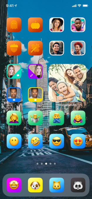
Image Credits: Contrast/Launch Center Pro

Much of the work to make this possible had already been done last year for iOS 13, says Launch Center Pro’s developer David Barnard. But iPhone home screen customization never really took off until this month, thanks to the launch of iOS 14. With the OS update, developers have finally been able to ship widgets of different sizes alongside their apps to offer a more engaging experience directly on users’ home screens.

While the original intention was focused on bringing informational updates from existing apps to the home screen, a handful of developers leveraged the new capabilities to build specialized widget design tools. These widget-making apps have allowed users to create widgets of many sorts and sizes, using a variety of colors and styles. Widgetsmith, for example, has been topping the App Store charts as users began to customize their home screens.

In addition, a number of users figured out how to use Apple’s Shortcuts to replace the icons associated with their favorite apps in order to create entirely unique, themed home screen experiences. Tutorials popped up on TikTok and the hashtag #iOS14homescreen began trending on Twitter as people shared the end results of their iPhone makeovers.

But one obstacle to redesigning the home screen was that you either needed to find a set of custom icons to use or design your own using an app like PicsArt or Photoshop, for example. And this could be challenging for those who don’t regularly work with creative tools. That’s where Launch Center Pro comes in:

@launchcenterproBuild your own custom icons for iOs 14! More tips to come! ##ios14homescreen ##ios14 ##homescreen♬ original sound – Launch Center Pro

The app offers simple tools that let you build your own icons without needing to be a design expert. Instead, you simply pick the icon shape, the color and the glyph, then optionally add a frame or badge. Apple’s Shortcuts app offers a similar set of tools, but with far fewer options.

The icons you make can then either be used with the Shortcuts app by exporting the icon to your Camera Roll or they can be used inside Launch Center Pro’s classic Today View widgets. These widgets can include not just favorite apps, but specific actions or tasks — like messaging a favorite friend, getting directions or anything else you commonly do on your phone.

Unfortunately, Launch Center Pro hasn’t yet released iOS 14-compatible home screen widgets at this time.

However, the team expects to have those ready later this fall, along with other big updates. In the meantime, the company hopes its icon designer will come in handy in these early days of iOS 14 customizations. They also plan on releasing smaller updates focused on improving the icon design experience in the weeks ahead.

Launch Center Pro is available as a free download on the App Store.


from Apple – TechCrunch https://ift.tt/33WJXdd

You can now return Apple’s Solo Loop for a new size, without sending back the Watch

Call it Apple Bandgate, if you must. It’s the latest online dustup, following Apple’s recent Watch Series 6 release. The announcement of the Solo Loop was more or less glossed over during last week’s big event, because, well, watch bands don’t often take center stage at hardware events.

As is often the case, retail availability was quickly followed by purchaser returns. That happens just about any time a new product is released, of course, but things were complicated here for a couple of reasons. For starters, the clasp-free bands come in a variety of different sizes to fit different-sized wrists. That’s further complicated by the fact that trying bands on in-store really isn’t a great option these days.

The initial returns were met with buyer frustration. For starters, many were reporting difficulty getting the correctly sized band, based on online measurements. Also many expressed frustration with a policy that required the entire watch to be sent back to Apple as part of the return process.

Image Credits: Apple

Apple has since clarified and addressed some of the issues. For starters, users can now just replace the band (rather than the entire Watch) either in-store or by mail. That is assuming they have the replacement size. Apparently the company’s been having some trouble keeping some of the styles/sizes in stock. The company has also updated the pricing chart for the bands with additional detail to get a better fit. The process involves printing out the tool, cutting it out and then wrapping it around your wrist. Not exactly the  most high-tech or most ideal method, but it should hopefully work in a pinch.

I will say for my part that I quite like the band. It’s comfortable and it’s got a nice elastic spring that adheres nicely to movement. I’m a fan of the braided version in particular. That said, the company seemed to have triangulated my potential size and gave me a couple of options to try. One of them fits nicely. Not everyone has the ability to do that from home, so you’ll want to get it as close as you can using that tool.

And keep in mind, it’s not simply a comfort thing, either. Some features like the new SpO2 monitor require the right fit, otherwise it can be a bit of a frustrating experience.


from Apple – TechCrunch https://ift.tt/3kF1Ofw

Coinbase UX teardown: 5 fails and how to fix them

Digital currency exchange Coinbase has probably done more than most to push cryptocurrencies closer to the mainstream, earning an $8 billion valuation by private investors along the way. The company is reportedly eyeing a public listing next year, and is inarguably doing a lot of things right. However, that doesn’t mean its product experience is perfect. In fact, far from it.

In our latest UX teardown, with the help of Built for Mars founder and UX expert Peter Ramsey, we highlight some of Coinbase’s biggest user experience failings and offer ways to fix them. Many of these lessons can be applied to other existing digital products or ones you are currently building, including the need to avoid the “Get Started” trap, the importance of providing feedback, why familiarity often wins and other principles.

The ‘Get Started’ trap

Only use CTAs like “get started” or “learn more” if you’re actually teaching users something.

The fail: Coinbase doesn’t actually have any onboarding — but it looks like it does. It has a very prominent “get started” CTA, which actually just puts bitcoins in your basket. This isn’t helping you get started, it’s nothing more than an onboarding Trojan horse.

The fix: It’s simple: Don’t lie in your CTAs. You wouldn’t have “Email Support” as a CTA, and then just show the user a bunch of FAQs.

Steve O’Hear: This feels like another classic “bait and switch” and reeks of dark pattern design. However, what if it actually works to get users over the line and purchase their first bitcoin? Growth hackers, rejoice, no?

Peter Ramsey: You’re absolutely right, this may convert better. From a business point of view, this could be a brilliant little growth hack. However, something converting well doesn’t mean it was a good experience for the user. Look at clickbait-y journalism — it gets more eyeballs, but people aren’t generally happy with what they read.

I’m convinced that in the long term having a great product will perform better than frustrating short-term growth hacks.

Feedback architecture

As a general rule of thumb, all “states” — e.g., success/failure of an action — need to provide feedback to the user.

The fail: After adding a card, you click “Add Card,” and … it takes you back to the homepage. There’s no notice if it was successful or not. The user has no awareness if the action they were trying to do failed and they need to do it again. This is a real problem with digital products: All feedback needs to be thought of and built.

The fix: During the design phase, consider statuses and what the user will want feedback on. For example, if they’ve just added an item to their “wishlist,” how will you show them that the action was successful?


from Apple – TechCrunch https://ift.tt/33PMW7a

App makers band together to fight for App Store changes with new ‘Coalition for App Fairness’

A number of top app makers have banded together to fight against Apple’s control of its App Store and, to a lesser extent, Google’s control of the Play Store — a topic of increased regulatory scrutiny in recent months. Today, 13 app publishers, including Epic Games, Deezer, Basecamp, Tile, Spotify and others, have launched the Coalition for App Fairness. The new organization formalizes efforts the companies already have underway that focus on either forcing app store providers to change their policies, or ultimately forcing the app stores into regulation.

Epic Games, for example, is currently involved in a lawsuit against Apple over the App Store’s commission guidelines. Basecamp’s launch of its Hey email app led to a public battle between the two after Apple blocked the app’s updates for its decision to not use Apple’s own in-app purchase platform. Other app makers in the group have through public statements previously spoken out against Apple’s practices, and some have also communicated their complaints to Congress.

Included in the new group of app makers are Basecamp, Blix, Blockchain.com, Deezer, Epic Games, the European Publishers Council, Match Group, News Media Europe, Prepear, Protonmail, SkyDemon, Spotify and Tile.

On the coalition’s website, the group details its key issues, which include anti-competitive practices, like the app stores’ 30% commission structure, and the inability to distribute software to billions of Apple devices through any other means but the App Store, which the group sees as an affront to personal freedom.

Google allows apps to be side-loaded, so it’s not as much of a target on this front. In fact, much of the focus of the coalition’s efforts have to do with Apple’s business, given its stricter guidelines.

Of course, much of Apple’s success in the app economy can be attributed to its tight controls over how apps are created, designed, reviewed and distributed. Its App Store is purged of junk and spam more often and app reviews are handled largely by humans, not automated tech. Apple app developers also have to abide by guidelines that control how their app should look and feel, what sort of content is allowed and how those apps should behave. Its rules around in-app purchases have also led to a customer experience where making purchases inside an app are as simple as pressing down your thumb or clicking a button, then looking at your phone to complete a transaction.

On the flip side, however, Apple’s guidelines don’t offer much freedom to businesses that have no need to rely on the App Store for things like customer acquisition, search ads or the handling of payments. They may also be capable of hosting their own app and services and their own infrastructure, but have no choice but to use Apple’s platform to reach iOS customers.

“As enforcers, regulators, and legislators around the world investigate Apple for its anti-competitive behavior, The Coalition for App Fairness will be the voice of app and game developers in the effort to protect consumer choice and create a level playing field for all,” said Horacio Gutierrez, head of Global Affairs and chief legal officer at Spotify, in a statement issued by the group on Thursday.

The group has also published a list of 10 “App Store Principles” it would like to see enacted industry-wide. These include the ability to distribute apps outside of app stores, protections from having their own data used against them to compete, timely access to developer documentation, the right to communicate with users through its app for legitimate business purposes, no requirements to use the app store’s payment systems, no requirements to pay unfair fees and more.

The members have also issued individual statements, which are available on the group’s website and, perhaps mostly importantly, they’ve launched a mechanism to recruit new members. App makers who feel similarly oppressed by Apple’s practices are able to fill out a form to request to join.

The organization says this represents “an open call to all developers, big and small, to join us.”

Apple didn’t directly comment on the group’s launch, but it did today release new resources, including a redesign of its About the App Store page that details its benefits, the addition of a page that focused specifically on developer benefits, an overview of the advantages provided by its app developer program and a new site that explains its Apple Video Partner program and how to apply.

Apple tends to not be transparent about some of its programs. Instead, it tends to brief press on background when its rules change (or it say, launches new websites…), instead of issuing public statements, writing blog posts, or issuing press releases. When reached for comment over App Store issues, Apple rarely goes on record.

But the company’s inner operations were revealed during the recent antitrust hearings, which brought to light how it cut a special deal with Amazon, how it determined which apps to commission and how it handled complex decisions — like banning an entire category of apps by claiming they were now a privacy threat, instead of offering an alternative path to remain in business.

The backlash over this behavior has been bubbling up for years and is now coming to a head thanks to the regulator investigations. Not all the companies fighting Apple are necessarily in it to save the little guy, however. Had Apple quietly cut special deals with Epic or Spotify too, you may have never heard from them about App Store abuses.


from Apple – TechCrunch https://ift.tt/3303ISc

NUVIA raises $240M from Mithril to make climate-ready enterprise chips

Climate change is on everyone’s minds these days, what with the outer Bay Area on fire, orange skies above San Francisco, and a hurricane season that is bearing down on the East Coast with alacrity (and that’s just the United States in the past two weeks).

A major — and growing — source of those emissions is data centers, the cloud infrastructure that powers most of our devices and experiences. That’s led to some novel ideas, such as Microsoft’s underwater data center Project Natick, which just came back to the surface for testing a bit more than a week ago.

Yet, for all the fun experiments, there is a bit more of an obvious solution: just make the chips more energy efficient.

That’s the thesis of NUVIA, which was founded by three ex-Apple chip designers who led the design of the “A” series chip line for the company’s iPhones and iPads for years. Those chips are wicked fast within a very tight energy envelope, and NUVIA’s premise is essentially what happens when you take those sorts of energy constraints (and the experience of its chip design team) and apply them to the data center.

We did a deep profile of the company last year when it announced its $53 million Series A, so definitely read that to understand the founding story and the company’s mission. Now about one year later, it’s coming back to us with news of a whole bunch of more funding.

NUVIA announced today that it has closed on a $240 million Series B round led by Mithril Capital, with a bunch of others involved listed below.

Since we last chatted with the company, we now have a bit more detail of what it’s working on. It has two products under development, a system-on-chip (SoC) unit dubbed “Orion” and a CPU core dubbed “Phoenix.” The company previewed a bit of Phoenix’s performance last month, although as with most chip companies, it is almost certainly too early to make any long-term predictions about how the technology will settle in with existing and future chips coming to the market.

NUVIA’s view is that chips are limited to about 250-300 watts of power given the cooling and power constraints of most data centers. As more cores become common pre chip, each core is going to have to make do with less power availability while maintaining performance. NUVIA’s tech is trying to solve that problem, lowering total cost of ownership for data center operators while also improving overall energy efficiency.

There’s a lot more work to be done of course, so expect to see more product announcements and previews from the company as it gets its technology further finalized. With $240 million more dollars in the bank though, it certainly has the resources to make some progress.

Shortly after we chatted with the company last year, Apple sued company founder and CEO Gerald Williams III for breach of contract, with the company arguing that its former chip designer was trying to poach employees for his nascent startup. Williams counter-sued earlier this year, and the two parties are now in the discovery phase of their lawsuit, which remains ongoing.

In addition to lead Mithril, the round was done “in partnership with” the founders of semiconductor giant Marvell (Sehat Sutardja and Weili Dai), funds managed by BlackRock, Fidelity, and Temasek, plus Atlantic Bridge and Redline Capital along with Series A investors Capricorn Investment Group, Dell Technologies Capital, Mayfield, Nepenthe LLC, and WRVI Capital.


from Apple – TechCrunch https://ift.tt/3i6pWpW

UK launches COVID-19 exposure notification app for England and Wales

The last two regions of the UK now have an official coronavirus contacts tracing app, after the UK government pushed the button to launch the NHS COVID-19 app across England and Wales today.

Northern Ireland and Scotland launched their own official apps to automate coronavirus exposure notifications earlier this year. But the England and Wales app was delayed after a false start back in May. The key point is that the version that’s launched now has a completely different app architecture.

All three of the UK’s official coronavirus contacts tracing apps make use of smartphones’ Bluetooth radios to generate alerts of potential exposure to COVID-19 — based on estimating the proximity of the devices.

A very condensed version of how this works is that ephemeral IDs are exchanged by devices that come into close contact and stored locally on app users’ phones. If a person is subsequently diagnosed with COVID-19 they are able to notify the system, via their public health authority, which will broadcast the relevant (i.e. ‘risky’) IDs to all other devices.

Matching to see whether an app user has been exposed to any of the risky IDs also takes place locally — meaning exposure alerts are not centralized.

The use of this decentralized, privacy-preserving architecture for the NHS COVID-19 app is a major shift vs the original app which was being designed to centralize data with the public health authority.

However the government U-turned after a backlash over privacy and ongoing technical problems linked to trying to hack its way around iOS limits on background access to Bluetooth.

Switching the NHS COVID-19 app to a decentralized architecture has allowed it to plug into coronavirus exposure notification APIs developed by Apple and Google — resolving technical problems related to device detection which caused problems for the earlier version of the app.

In June, the government suggested there were issues with the APIs related to the reliability of estimating distance between devices. Asked about the reliability of the Bluetooth technology the app is used on BBC Radio 4’s Today program this morning, health secretary Matt Hancock said: “What we know for absolute sure is that the app will not tell you to self isolate because you’ve been in close contact with someone unless you have been in close contact. The accuracy with which it does that is increasing all of the time — and we’ve been working very closely with Apple and with Google who’ve done a great job in working to make this happen and to ensure that accuracy is constantly improved.”

The health secretary described the app as “an important tool in addition to all the other tools that we have” — adding that one of the reasons he’d delayed the launch until now was because he didn’t want to release an app that wasn’t effective.

“Everybody who downloads the app will be helping to protect themselves, helping to protect their loves one, helping to protect their community — because the more people who download it the more effective it will be. And it will help to keep us safe,” Hancock went on.

“One of the things that we’ve learnt over the course of the pandemic is where people are likely to have close contacts and in fact the app that we’re launching today will help to find more of those close contacts,” he added.

The England and Wales app does have some of unique quirks — as the government has opted to pack in multiple features, rather than limiting it to only exposure notifications.

These bells & whistles include: risk alerts based on postcode district; a system of QR code check-in at venues (which are now required by law to display a QR code for app users to scan); a COVID-19 symptom checker and test booking feature — including the ability to get results through the app; and a timer for users who have been told to self-isolate to help them keep count of the number of days left before they can come out of quarantine, with pointers offered to “relevant advice”.

“[The app] helps you to easily go to the pub or a restaurant or hospitality venue because you can then click through on the QR code which automatically does the contact tracing that is now mandatory,” said Hancock explaining the thinking behind some of the extra features. “And it helps by explaining what the rules are and the risk in your area for people easily and straightforwardly to be able to answer questions and consult on the rules so it has a whole series of features.”

It remains to be seen whether it was sensible product design to bolt on all these extras — and QR code venue check-ins could carry a risk of confusing users. However the government’s logic appears to be that more features will encourage more people to download the app and thereby increase uptake and utility.

Once widespread, the mandatory venue QR codes will also effectively double as free ads for the app so that could help drive downloads.

More saliently, the Bluetooth exposure notification system depends on an effective testing regime and will therefore be useless in limiting the spread of COVID-19 if the government can’t improve coronavirus test turnaround times — which it has been struggling with in recent weeks, as major backlogs have built up.

Internet law expert, professor Lilian Edwards — who was on an ethics advisory panel for the earlier, now defunct version of the England & Wales app — made this point to BBC Radio 4’s World at One program yesterday.

“My main concern is not the app itself but the interaction with the testing schedule,” she said. The app only sends out proximity warnings to the contacts on upload of a positive test. The whole idea is to catch contacts before they develop symptoms in that seven-day window when they won’t be isolating. If tests are taking five to seven days to get back then by that time the contacts will have developed symptoms and should hopefully be isolating or reporting their symptoms themselves. So if we don’t speed up testing then the app is functionally useless.”


from Apple – TechCrunch https://ift.tt/304rISi

Wednesday, 23 September 2020

The eighth-generation iPad is a fine choice for casual users

It happens to the best of us. Some newer, flashier model comes along and we’re no longer the latest and greatest new thing. The iPad’s had a plenty good run, of course. Ten years ago, the device redefined what a tablet is and has maintained a dominant spot atop the category, as countless competitors have fallen away. Apple recently announced that it has sold north of 500 million units over the life of the device.

These days, the device has been overshadowed by its own brand. The standard iPad has become something of an also-ran, compared to the Pro and Air. Now in its eighth generation, the product represents the entry level for Apple’s tablet offerings. While the Air took center stage at the company’s recent hardware event, it did extend some love to the iPad.

The latest version of the tablet retains the familiar design of recent generations, including the 10.2-inch display (up from 9.7) and smart connector on the side of the device for accessories introduced the last time out. The size isn’t too dissimilar from the Air — it’s a touch taller and about a millimeter and a half thicker, weighing in at an additional 32 grams.

Image Credits: Brian Heater

This is the last of three iPads to hang onto the Lightning Port — that’s certainly starting to feel like a bit of a relic. The upshot of that, however, is that the product continues to be compatible with older accessories, which means there’s a good chance you’ll save a little extra cash on that end, as well. The tablet also ships with a larger charger than the previous generation.

The biggest update this time out is, unsurprisingly, internal. The new version of the slate gets the same A12 — marking the first such upgrade for the device in two years. The update puts it a generation behind the Air, which received the A12 last year and has been upgraded to the A14. The Pro, meanwhile, currently sports the A12Z. Confusing, I know, but the main thing you need to know here is that the iPad is the entry-level model.

That includes the display, which is smaller than the other models and lacks the 120Hz refresh rate and brighter display of the Pro. Nor does it sport Apple’s True Tone display tech or the Face ID found on the Pro, instead retaining the home button Touch ID (versus the power button on the Air). The two-speaker system is also lacking compared to the quad-speakers on the Pro, most notably when you’re watching a movie on the tablet in landscape mode.

The battery is rated at 10 hours, which puts it in line with the other devices. I found I was able to get something in line with the company’s stated “all day life” for the product. If you’re someone like me who just uses a tablet for a couple of hours a day for entertainment purposes, you should be able to get away with charging it every few days.

Image Credits: Brian Heater

The iPad is compatible with the standard Smart Keyboard, but not the new Magic Keyboard. If you’re looking for something that can seriously replace your PC, you’re going to want to take a good long look at the Pro. The iPad is fine for sending emails and the like, but beyond that, you’re going to want to consider something more robust.

The iPad is really the workhorse of the line. Starting at $329 for the 32GB model, it’s by far the least expensive iPad model. The Air and Pro start at $599 and $799, respectively. And sale prices are a certainty, heading into the holiday season. As I type this, the entry-level device is currently marked down to $299 on Amazon.

The truth is, for most users, the standard iPad will be more than enough for most applications. Certainly that applies to people who are looking for devices to check email, visit some sites, play mobile games and watch Netflix (though it might be time to reconsider its camera placement in the age of teleconferencing). The iPad isn’t the king of the hill it once was among Apple tablets, but it remains a fine device.


from Apple – TechCrunch https://ift.tt/300Bp48