Monday, 24 June 2019

iPadOS preview

Microsoft drew a line in the sand with Windows 10, presenting an operating system designed for both PCs and tablets alike. The move fostered hardware designers to go all in on convertibles — devices that performed double duty as laptops or slates, with adjustable keyboards to match.

For most of its history, the iPad has taken the opposite approach. Even as Apple has blurred the line between iOS and macOS with offerings like Project Catalyst, the tablet that redefined the category has been mobile first, running a scaled up version of the iPhone operating system. It’s largely suited the company and the product well, offering a dead simple approach for consumers.

But as the iPad has matured, so too have customer expectations. In recent years, Apple’s happily positioned the product as a kind of laptop alternative for business and education. The push has been accelerated with the arrival of the iPad Pro and Apple Pencil, which has made it a more compelling offering for creative pros, along with additional features to help facilitate multitasking.

The arrival of iPadOS marks the next key step in the tablet’s evolution. The device has already received a number of features designed specifically for its larger form factor and computing power, but the rebranding is the company’s way of asserting that the forked operating system is coming into its own, with a slew of features designed specifically to cater to its growing position as a productivity device.

In future iterations, iPadOS will be getting most or all of iOS’s updates at the same time as the iPhone OS. This time out, that includes iOS 13’s Dark Mode, the maps update and redesigned Photos for starters. But as the first iteration of the new rebrand, iPadOS is getting a number of new or updated pieces specific to the tablet.

The update starts with Home Screen. Like many of the features on board, the refreshed home screen is all about fitting more into the extended real estate, rather than just making a larger version of the existing layout, as iOS has done in the past. That includes fitting more icons on the screen — 30 in all (plus whatever you’ve got in the dock), segmented into six by five.

Swiping right will bring up a river widget on the left side, just under the newly pinned date and time in the upper left corner. The widget features quick glance features like calendar appointments, weather and photos. Swipe all the way down for settings and you can permanently pin it to the home screen, if you so desire.

Multitasking, on the other hand, is the real centerpiece of the update. Slide Over, which offers a a second floating app window gets some key improvements, including the ability to have several different apps open in the mode at once by dragging them from the dock. Swiping up to the middle of the screen will display all of the apps open in slide over like a deck of cards. Swipe all the way up and the app will go full screen.

Also of note is the ability to open multiple windows for a single app. It’s something, like much of this multitasking stuff, that we tend to take for granted on the desktop. It’s partially useful, however, for certain applications like Pages, where you tend to utilize notes from one document for writing in another.

There is, perhaps, no clear sign that the company is attempting to offer a more desktop like experience here than the updates to files. The changes are about giving users more control over the file systems on their device — it’s something the company has tended to hide away from the end user, ostensibly to give a simpler experience. Doing that, however, obfuscates interactions, something that ought to be a lot clearer if the iPad is designed to be a more professional machine.

The list includes the ability to plug in external hard drives via the USB C port, which will save a lot of additional dragging and dropping. Those mounted drives will populate the Locations column in the files app. Files can also be imported straight from SD cards and cameras into apps like Lightroom. Also worth noting are the ability to zip and unzip folders inside of the Files app and the addition of a download folder, offering more direct access to content downloaded via Mail, Safari and the like.

The iPadOS public beta is available today, along with iOS 13 and macOS Catalina. The final version is set to arrive in the fall.


from Apple – TechCrunch https://tcrn.ch/31VgRci

Apple says Spotify exaggerated how much ‘App Store tax’ it pays

In March, Spotify filed a complaint against Apple with the European Commission over the so-called “Apple tax” and claims of restrictive rules regarding the App Store. In the time since, Apple has responded with the launch of a website that takes aim at the anti-trust, anti-competitive claims against it, and most recently, a deep dive into how the process of app approvals work, by way of a CNBC profile. Now, Apple has responded to the EC complaint with its own filing which says Spotify is only paying this “Apple tax” on less than one percent of its paid subscribers.

This news was first reported by Music Business Worldwide (MBW) and German site Der Spiegel.

Specifically, Apple’s filing says that Spotify only pays a 15% “app tax” (revenue share) on just 0.5% of its 100 million premium subscribers, or around 680,000 customers. This revenue share only impacts those customers Spotify acquired during the 2014-2016 time frame who signed up for the subscription through an in-app purchase. Afterward, Spotify switched off the option to sign up in the app.

This is contrast to the claim made by Spotify CEO Daniel Ek on the company’s blog in March, where he wrote that “Apple requires that Spotify and other digital services pay a 30% tax on purchases made through Apple’s payment system.”

In addition, MBW reports, citing an unnamed source, that Spotify pays even less than the standard 15% for those customers who signed up through in-app purchase due to label discounts. The source told the outlet that Spotify just wants to “pay nothing.”

However, Spotify’s claim goes beyond the Apple tax.

It also said that Apple used its App Store power to penalize the competitor in other ways — like limiting Spotify’s ability to communicate with customers, or even send emails to its iOS users. Spotify said Apple also blocked its iOS upgrades — something it brought to light years ago. Apple, meanwhile, has always maintained it has treated Spotify like any other app developer.

Apple’s responses to these latter points were also sneaked into the recent CNBC piece where a “longtime Apple veteran” who was only identified as “Bill,” made certain to tell the news site that he had “called Spotify when an update was rejected” — e.g., because Spotify had been emailing customers and asking them to pay the music streamer directly, outside the App Store.

In addition to Spotify’s EU complaint, Apple is facing other attacks against its App Store in the U.S. courts.

The U.S. Supreme Court in May ruled against Apple to allow an App Store antitrust case to proceed.

And in June, two app developers proceeded to sue Apple over its App Store practices, making similar claims about Apple’s 30% commission on app sales and its requirement to price apps in tiers ending in 99 cents.

Apple had earlier responded to Spotify’s complaint in length on its own website. The company, in part, said that:

After using the App Store for years to dramatically grow their business, Spotify seeks to keep all the benefits of the App Store ecosystem — including the substantial revenue that they draw from the App Store’s customers — without making any contributions to that marketplace. At the same time, they distribute the music you love while making ever-smaller contributions to the artists, musicians and songwriters who create it — even going so far as to take these creators to court.

Apple’s approach has always been to grow the pie. By creating new marketplaces, we can create more opportunities not just for our business, but for artists, creators, entrepreneurs and every “crazy one” with a big idea. That’s in our DNA, it’s the right model to grow the next big app ideas and, ultimately, it’s better for customers.


from Apple – TechCrunch https://tcrn.ch/2FuUkK2

iOS 13 brings many much needed quality-of-life improvements

In developer lingo, quality-of-life updates are all about refining things that already work. Thanks to these incremental improvements, it should make the end user experience much more enjoyable. And with iOS 13, it feels like Apple’s main focus is on this concept.

Dark Mode is basically the only new flashy feature of iOS this year. But that’s not a bad thing. From my experience, all the tiny refinements across the board are really convincing. iOS 13 is a much more interesting release than iOS 12 for instance.

I’ve been playing with early beta versions of iOS 13, so here’s what you should be looking for.

Dark Mode is gorgeous

Dark Mode is here, and it looks great. It’s a system-wide trigger that completely transforms the look and feel of your iPhone — you have to play with it to really feel the difference. The easiest way to activate it is by opening the Control Center panel, long pressing on the brightness indicator and turning it on.

While you can trigger it manually, you can also select an automated mode in the settings. Right now, my phone becomes dark at night and lights up in the morning. iOS uses your current location to time the change with the sunset and sunrise.

Widgets, notifications and menus now use black or transparent black as much as possible. You can choose new Apple wallpapers that change when you turn on Dark Mode, or you can optionally dim your custom wallpapers at night.

Apple has updated all its apps to support Dark Mode, from Notes to Mail, Messages, Safari and more. And it works really well with those apps.

But the issue is that many third-party apps haven’t been updated for Dark Mode yet. So it’s a disappointing experience for now, but I’m sure many app developers will update their apps before the final release of iOS 13.

Many apps already support have a dark version that you can trigger in the app settings. But Apple really wants third-party developers to follow the system-wide option going forward. So those apps will have to be updated as well.

Low-level improvements

iOS still looks like iOS. But if you carefully pay attention to your first experience of iOS 13, you’ll notice two things. First, animations have been sped up — it feels like unlocking your phone, opening and closing an app or swiping on a notification are much faster. It’s hard to know if those actions have been optimized or if it’s just Apple hitting the fast-forward button.

Second, Face ID is better. It’s not a dramatic change, but your phone recognizes you a tiny bit faster than before. iPhone users will appreciate that they don’t have to buy a new phone for this free improvement.

The two other iOS 13 changes that you can experience in any app is that the keyboard now supports swipe-to-type and the share sheet has been updated. It is now separated in three areas: a top row with suggested contacts to send photos, links and more depending on your most important contacts.

Under that row of contacts, you get the usual row of app icons to open something in another app. If you scroll down, you access a long list of actions that vary from app to another.

Siri and the Shortcuts app have been improved and now work more closely together. In addition to a more natural Siri voice, Shortcuts is now installed by default with iOS, which is great news for automation and scripting on your phone.

And I was surprised to see all my voice-activated Siri Shortcuts in the Shortcuts widget. For instance, since iOS 12, I’ve been able to say “Hey Siri, I’m heading home with Citymapper” to launch Citymapper with directions to my home. There’s now a button in the Shortcuts app to trigger that Siri Shortcut.

More interestingly, you can now create automated triggers to launch a shortcut. For instance, you can create scenarios related to CarPlay, a location or even a cheap NFC tag. Here are some examples:

  • Launch a music playlist when I connect my phone to CarPlay or to my car using Bluetooth.
  • Dim my screen and turn on low power mode when I activate airplane mode.
  • Turn off my Philips Hue lights when I put my phone on an NFC sticker on my nightstand.

App improvements

All first-party apps have been improved in one way to another. Some changes are small, but a few apps have received a massive update.

Photos looks completely different with a new main tab. Instead of relatively boring looking grid of photos, you now get four sub-tabs that should help you navigate your photo library more efficiently.

‘Years’ lets you jump straight to a specific year. The ‘Months’ view is the most interesting one as iOS tries to sort your photos in smart albums based on dates and locations. When you open an event, you get the best photos of this event in the ‘Days’ tab. Some photos, such as duplicates are hidden by default.

And the last tab, ‘All Photos’ features the traditional never-ending grid of all your photos in your camera roll. Everything is still there. Live photos and videos now automatically play by default in some views. I’ve never been a fan of autoplaying videos but I guess that’s what people like.

The camera has been slightly improved, especially when it comes to Portrait mode with better segmentation of hair. And photo editing has been redesigned — it looks more like VSCO now.

Maps is getting a gradual update with better mapping data. But most people won’t see any change for a while. You can see real-time transit data, your flight status and share lists of places with friends though. It might not replace Citymapper, FlightLogger or Mapstr, but more contextual data is key when it comes to competing with Google Maps.

Talking about Google Maps, there’s a new Look Around feature that could have been called Apple Street View. I recommend trying the feature in San Francisco because it’s stunning. This isn’t just 360 photo shots — those are 3D representations of streets with foregrounds and backgrounds.

Messages is getting some much needed improvements. You can now choose a profile name and profile picture and share it with your contacts. I hate the default grey avatar, so it’s great to let people push a profile picture to other people.

If you have a Memoji-compatible device, you can now share Memoji stickers. If you’ve used Bitmoji in the past, this is Apple’s take on Bitmoji. And finally, search has been improved and is now actually useful. You can find an address or a specific message in no time.

Health has been redesigned but features more or less the same data. But it’s worth noting that Apple now lets you track, visualize and predict your menstrual cycle from the Health app.

Privacy

iOS 13 has a big emphasis on privacy as well thanks to a new signup option called “Sign In with Apple”. I couldn’t try it as I couldn’t see the option in any app. But Sarah Perez already wrote a great explainer on the topic.

In a few words, this button will let you create an account for a service without inputing an email address and password, and without connecting with your Google or Facebook account. Apple keeps as little data as possible — it’s all about creating a unique identifier and storing that in your iCloud keychain.

Apple is adding more ways to control your personal information. If an app needs your location for something, you can now grant access to your location just once. The app will have to ask for your permission the next time. Similarly, iOS 13 can tell you when an app has been tracking your location in the background with a map of those data points.

But I didn’t realize iOS 13 also blocks Bluetooth scanning by default in all apps. Many apps scan for nearby Bluetooth accessories and compare that with a database of Bluetooth devices around the world. In other words, it’s a way to get your location even if you’re not sharing your location with this app.

You now get a standard permission popup for apps that actually need to scan for Bluetooth devices — Mobike uses Bluetooth to unlock bikes or Eve uses Bluetooth to interact with connected objects for instance. But the vast majority of apps have no reason to scan for Bluetooth devices. You can decline Bluetooth permission and use Bluetooth headphones normally.

Random tidbits

Let’s go through some tiny little updates:

  • App updates are smaller because iOS doesn’t download everything from their servers — only files that are relevant to your current device.
  • Files works with Samba file servers, and you can zip/unzip files.
  • Safari features a new site settings popup to request the desktop site, disable a content blocker or enable reader view. This is much cleaner than before.
  • Notes has a new gallery view.
  • Mail lets you customize font style, size and color. You can also indent text, create bulleted lists, etc.
  • Find My iPhone and Find My Friends have been merged in a new Find My app. It also theoretically can help you find misplaced devices using other Apple devices from other people around your device — everything is supposed to be end-to-end encrypted.

Things I couldn’t try

  • CarPlay has been redesigned for the first time in years. But I don’t own a car.
  • You can store security camera footage in iCloud if your camera is HomeKit-compatible. But I don’t own a security camera.
  • ARKit has been improved and can detect people in the real world.
  • You can install custom fonts from the App Store and manage them from the settings. You can then use those fonts in any app.
  • Lyrics in the Music app now scroll just like in a karaoke. I haven’t tried that.
  • The Reminders app has been redesigned but I wasn’t using the app before. It feels like a full-fledged task manager now. Maybe I should use it.

Overall, iOS 13 feels like a breath of fresh air. Everything works slightly better than it used to. None of the changes are outrageous or particularly surprising. But they all contribute to making iOS a more enjoyable platform.


from Apple – TechCrunch https://tcrn.ch/2WZgKcb

Apple just released the first iOS and iPadOS 13 beta to everyone

This is your opportunity to get a glimpse of the future of iOS — and iPadOS. Apple just released the first public beta of iOS 13 and iPadOS 13, the next major version of the operating systems for the iPhone and iPad. Unlike developer betas, everyone can download those betas without a $99 developer account. But don’t forget, it’s a beta.

The company still plans to release the final version of iOS and iPadOS 13.0 this fall (usually September). But Apple is going to release betas every few weeks over the summer. It’s a good way to fix as many bugs as possible and gather data from a large group of users.

As always, Apple’s public betas closely follow the release cycle of developer betas. And Apple released the second developer beta of iOS and iPadOS 13 just last week. So it sounds like the first public beta is more or less the same build as the second developer build.

But remember, you shouldn’t install an iOS beta on your primary iPhone or iPad. The issue is not just bugs — some apps and features won’t work at all. In some rare cases, beta software can also brick your device and make it unusable. Proceed with extreme caution.

I’ve been using the developer beta of iOS and it’s still quite buggy. Some websites don’t work, some apps are broken.

But if you have an iPad or iPhone you don’t need, here’s how to download it. Head over to Apple’s beta website and download the configuration profile. It’s a tiny file that tells your iPhone or iPad to update to public betas like it’s a normal software update.

You can either download the configuration profile from Safari on your iOS device directly, or transfer it to your device using AirDrop, for instance. Reboot your device, then head over to the Settings app. In September, your device should automatically update to the final version of iOS and iPadOS 13 and you’ll be able to delete the configuration profile.

Here’s a quick rundown of what’s new in iOS 13. This year, in addition to dark mode, it feels like every single app has been improved with some quality-of-life updates. The Photos app features a brand new gallery view with autoplaying live photos and videos, smart curation and a more immersive design.

This version has a big emphasis on privacy as well thanks to a new signup option called “Sign in with Apple” and a bunch of privacy popups for Bluetooth and Wi-Fi consent, background location tracking. Apple Maps now features an impressive Google Street View-like feature called Look Around. It’s only available in a handful of cities, but I recommend… looking around as everything is in 3D.

Many apps have been updated, such as Reminders with a brand new version, Messages with the ability to set a profile picture shared with your contacts, Mail with better text formatting options, Health with menstrual cycle tracking, Files with desktop-like features, Safari with a new website settings menu, etc. Read more on iOS 13 in my separate preview.

On the iPad front, for the first time Apple is calling iOS for the iPad under a new name — iPadOS. Multitasking has been improved, the Apple Pencil should feel snappier, Safari is now as powerful as Safari on macOS and more.


from Apple – TechCrunch https://tcrn.ch/2N6WMwv

What startup names are most effective?

macOS 10.15 Catalina preview

There might be no better microcosm of 2019 Apple than Catalina. The latest version of macOS arrives during a transitional time for the company. The desktop is a showcase for increased focus on content, a continued push toward cross-platform compatibility and a renewed push to court creative professionals.

For a few years now, the desktop operating system has played second fiddle to iOS, but the long mobile honeymoon has begun to wane, as smartphone sales have begun to flag for the first time since Apple revolutionized the category with iPhone. The company clearly sees a future in the billion-dollar play of Apple TV+, while the return of products like long-lamented Mac Pro find it attempting to reassert its core audience.

macOS 10.15 has a lot updates to comb through, but the new stuff largely focuses on two primary categories:

  • Changes in the way Apple serves up content, with new versions of Apple Music and Podcasts (farewell, iTunes) and TV.
  • Playing more nicely with iOS and mobile devices. This, of course, has been a longtime push for the company, but the ease of porting iOS/iPadOS apps through Project Catalyst and Sidecar, which brings native second screen support to the iPad, are arguably the two biggest changes to the operating system this time around.

Apple Music

Apple users of a certain age got a little misty-eyed with this one. macOS updates are probably not the best way to mark the passage of time, but at least they appear year in, year out, like clockwork. Like the slow, silent death of the iPod Classic, the end of iTunes does point to the closing of an important chapter for the company — and digital music in general.

Apple, of course, has been prepping us for this inevitability for years now by breaking the iOS version of iTunes into separate Podcast and Music apps. Honestly, it’s a little surprising that it took so long for the desktop version to follow suit.

“Customers love iTunes and everything it can do. But if there’s one thing we hear over and over, is can iTunes do even more?” VP Craig Federighi jokingly asked onstage at WWDC — before offering a mock up of the application bundling in Calendar and Mail. That got a big laugh. Engineers love that stuff.

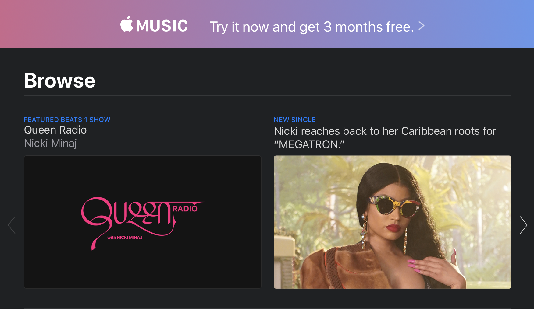
The company positioned the newer, leaner desktop version of Apple Music as part of the war against software bloat. That’s part of the story, but the real issue at play here is how the conversation has shifted from digital music ownership to subscription-based services. Apple Music is now more front and center, an added leg up in the company’s continued battle against services like Spotify.

Even with the name change and shift in focus, however, the app will prove familiar enough to longtime iTunes users, right down to the logo. And for those concerned about the total destruction of the nearly 20-year-old software, the iTunes name is, in fact, staying around in the form of the “iTunes Store,” which distinguishes the legacy download store from Apple’s streaming offering. No doubt labels are continuing to push access to music purchases, though whether “iTunes” will continue to exist in this small sliver of macOS remains to be seen.

For all of the sentimentality, the continued use of both “iTunes” and “Apple Music” has likely caused some level of confusion among consumers. Hell, I know I still refer to the Podcasts app as “iTunes” from time to time. Old habits, etc.

“For You” is now the centerpiece of the Apple Music experience. The homepage operates similarly to what you get with iTunes, offering up a combination of curated suggestions, recently played and recommendations from friends. The offering is more dynamic than before, tailoring more of the content to Apple Music listening.

If you’re like me (longtime Spotify user here), the app will prompt you to sign up for Apple’s service. This will no doubt serve as an annoyance for non-subscribers looking to listen to their own local music collection. You can largely avoid this by navigating directly to the Artists, Albums or Songs icons in the sidebar or by keeping your searches to “Your Library.”

Apple TV

The macOS version of the Apple TV app gets a major update following hot on the heels of its iOS counterpart. Apple’s very clearly priming the pump here to ready its billion-dollar premium streaming offering, which is due out at some point in the fall.

Like Apple Music, most of the big changes here are how the content, in preparation for what looks to be a pretty big paradigm shift for Apple heading into the end of the year. But while we’re all waiting for TV+ to drop, the company has brought one key addition to the app: Channels.

Announced at the company’s big TV event earlier this year, Channels integrates premium networks like HBO, Show and Start directly into the app. In addition to competing directly with Netflix, Hulu and the like, Apple is also hoping to replace your cable provider. And honestly, given the approval ratings of companies like Comcast and Time Warner these days, that might not ultimately be that much of a challenge. Of course, whether people look to Apple to take that step may depend on the success of TV+ as an effective Netflix replacement.

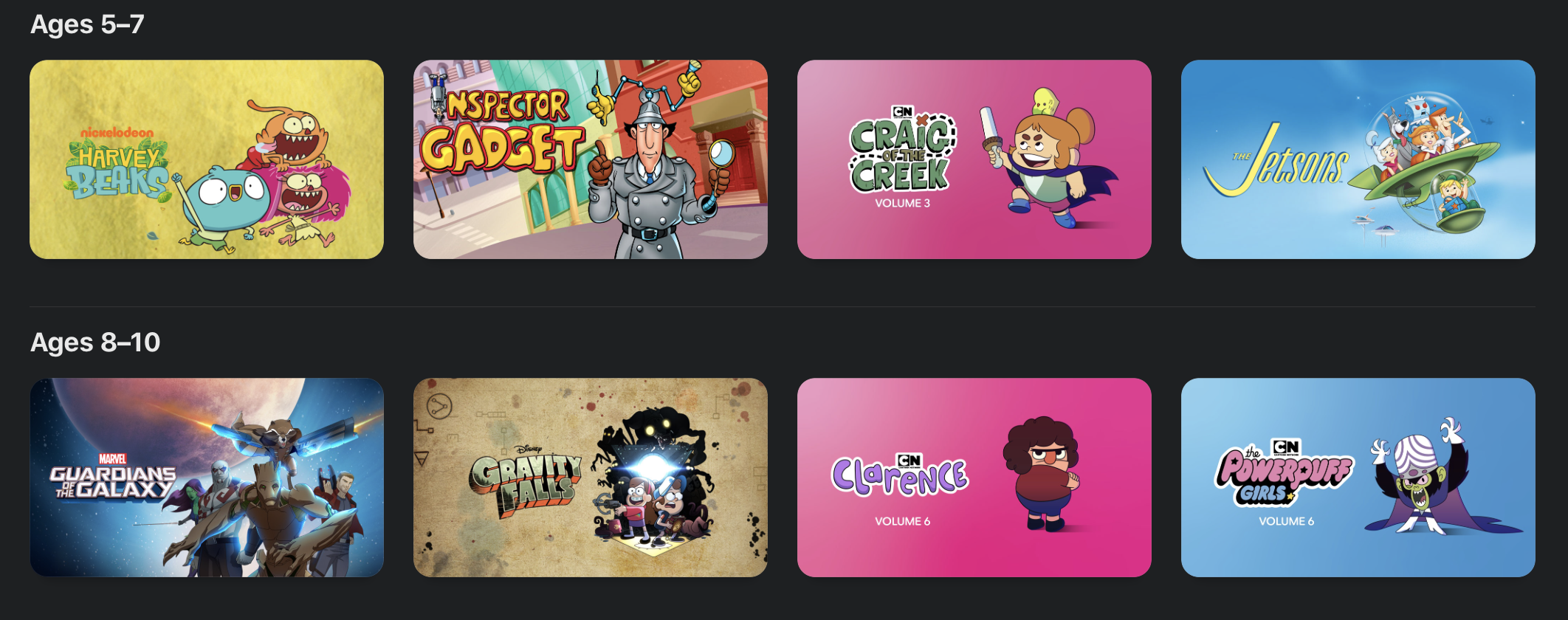
Up top, content is divided into four categories: Watch Now, Movies, TV Shows, Kids and Library. The format is similar to Apple Music, in that content discovery is pushed out from, with the library relegated to the last tab. For now, that means downloads and cable channels. In the future, that will no doubt mean a direct front up front to subscribe to Apple TV+. Likely the streaming service will have prominent placement among the Watch Now recommendation, along with its own tab up front.

Kids get their own tab this time out, as well. The tab curates family friendly fare into a single location, including some familiar IP like Mickey Mouse and Charlie Brown, along with movies and TV broken down by age groups (2-4, 5-7 and 8-10).

Podcasts

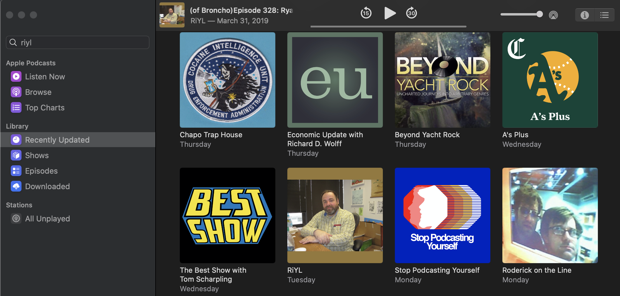
Podcasts have long had their moment in the sun on iOS with their own standalone app. Now they’ve been liberated on the desktop. Like the new Music app, Podcasts isn’t much of a departure from iTunes. Now that there’s something in the neighborhood of 700,000 individual shows, however, it’s probably about time they’ve got their own thing. Likely the app will take on more of its own individual voice as it matures.

As with the mobile version, Listen Now is the primary pane, offering up shows in reverse chronological order. This change was met with mixed results when the company implemented it on iOS. As someone who prefers to listen to podcasts in the order they’re posted, I’m not a particularly big fan of the setup. I’ll be spending more time listening from the bottom up in the Downloaded section.

I do wish the company offered a little more control over how shows are served up. I’m sure I’m not the only one who’s extremely particular about these sorts of things.

Like all the the other content updates, discovery continues to be king. The company has invested a lot in editorial curation in recent years, knowing that recommendations are the best and easiest ways to get people to keep engaging. It’s always nice to see podcasts getting an increased focus from big companies — Apple in particular. After all, it was one of its product lines that gave the medium its name.

Sidebar syncing

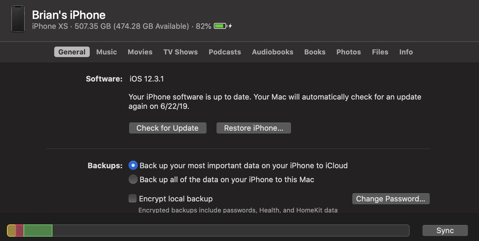
Here’s an interesting piece that didn’t get much love during the keynote earlier this month. Device media syncing has traditionally been the realm of iTunes. Now that the company has broken up and effectively sunset the app, it’s opted to integrate the feature directly into the finder.

Now when you plug in an iOS device, it will pop up in the Finder sidebar alongside other drives. From here, you can check to see if your software is up to date, restore the phone and manage backups. It also shows how much storage you’ve got left, battery charge and a bunch of other pertinent information.

A menu up top gives options for managing music, movies, TV shows, podcasts, audio books, books and photos. It’s a bit of an adjustment, managing all of that in the Finder, but it’s nice having it all up front, in one location.

Photos

I’ll be honest, I don’t really use Photos very often on the desktop. In fact, I’ve apparently never actually used it on the work laptop I’ve used to install Catalina (caution, meet wind), requiring me to walk through the install process. That said, there are some nice additions borrowed from the iOS version that do make the macOS version more engaging.

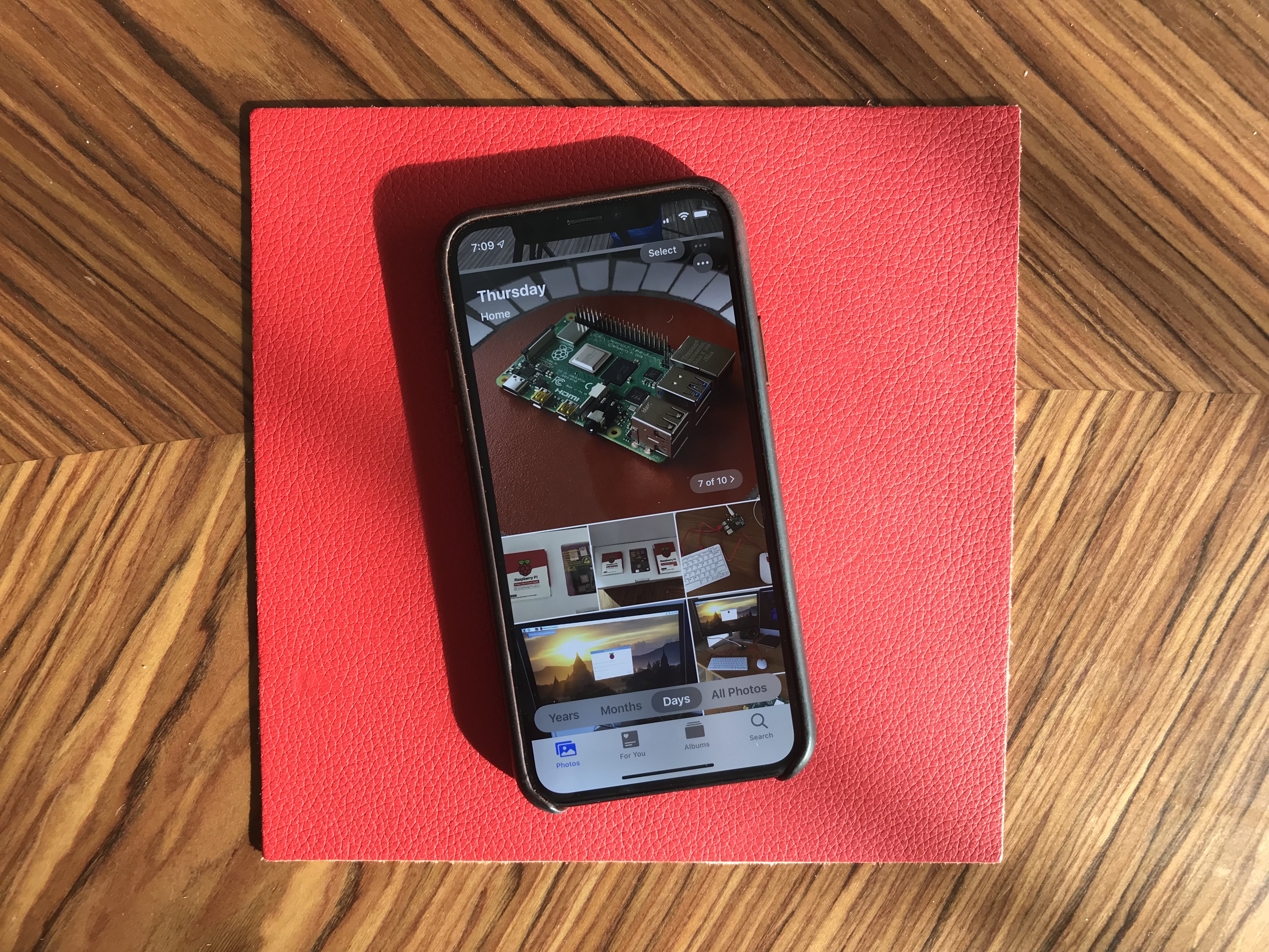
Users can view photos by Days, Months or Years. If you have location on for shots, the software will present things contextually, so you can view anniversaries and the like. Apple presented a really compelling application onstage with the birthdays of a child throughout the years, allowing you to see all of that date in one place. It’s a bit like a more powerful version of Facebook’s anniversary feature.

Like the iOS version, Apple uses AI to identify the “best” shots, which are presented in a larger format, while less aesthetically pleasing ones (I regularly snap photos of my hotel room numbers, for example) are removed from scrolling. The app will also auto-play live photos as you scroll through, for a more dynamic experience.
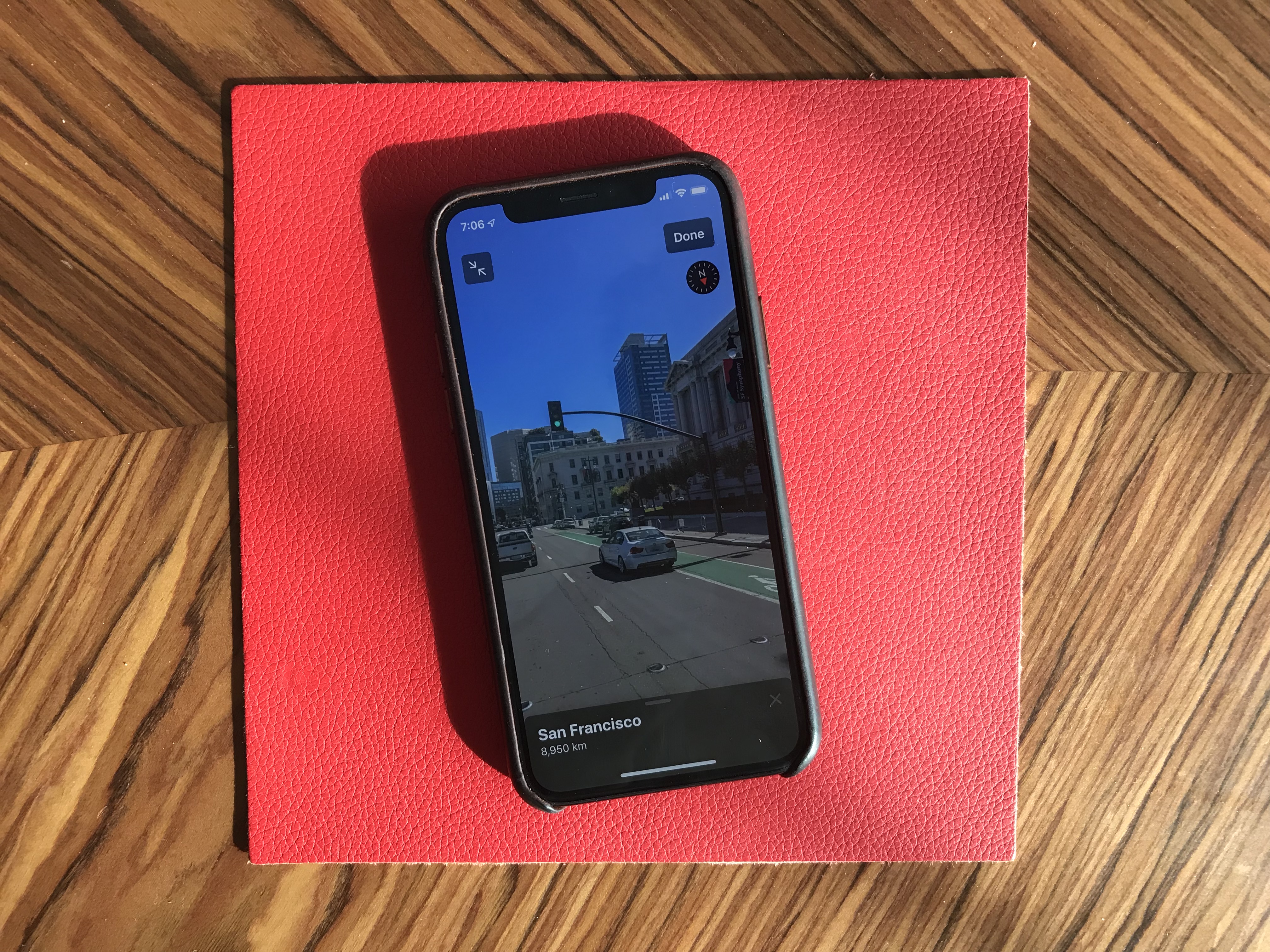
Sidecar

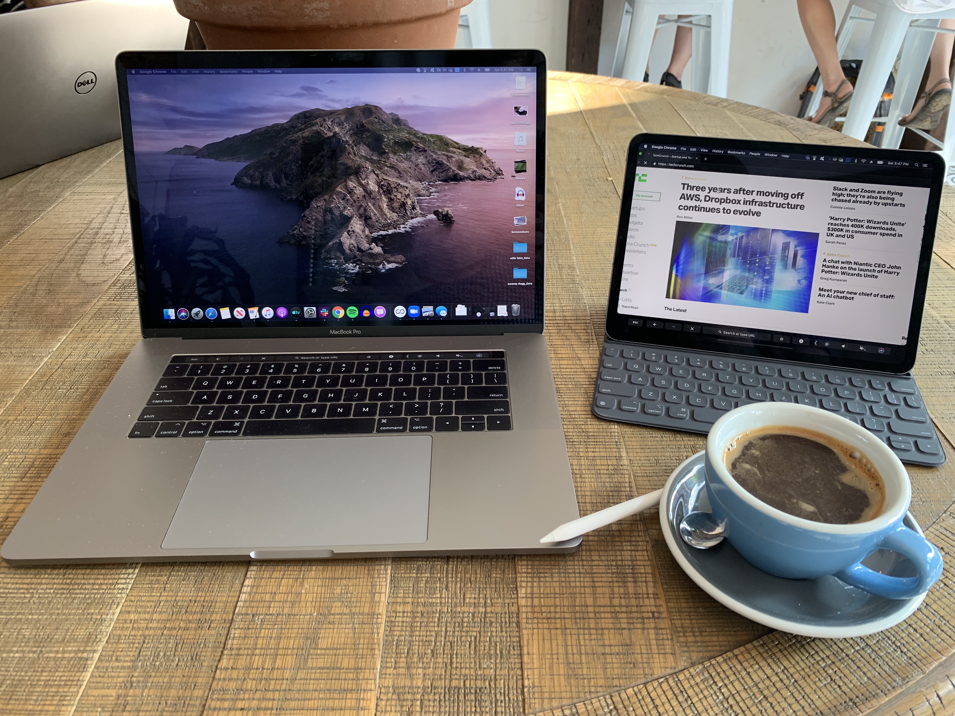
This is arguably the most eagerly awaited addition of the bunch — certainly it’s the one I’m most excited about. I’ve been a user of both Luna and Duet. And honestly, up until a few months ago, I didn’t expect this would be the sort of thing Apple would bake directly into their ecosystem. But here we are, and I’m excited. Third-party solutions have relied on clever workarounds with varying effects.

With Sidecar, iPads double as a secondary display. Third-party solutions have been a godsend for me on the road. When I get to my destination, I break out the iPad, set it up on a stand and use is it for my Tweetdeck feed and online resources while writing up stories in the main window.

All of this can be done with Sidecar’s extended desktop, but the feature takes things further, making this as close as we’ve come yet to an officially sanctioned touchscreen Mac, with touchscreen Apple Pencil input. The latter works by mirroring the display on the iPad. The effect is something like using a Wacom tablet to draw on the content housed on your primary display, while the Mac does all the heavy computational lifting.

That last part is particularly important, given who Apple is going after with the feature. Sure it’s handy among frequent travelers, but the real target here is creative professionals, a category that Apple once dominated outright, but for whom it has begun to experience increasing competition through the likes of Microsoft, with its Surface line.

The feature is compatible with pro apps with stylus support, from Photoshop to Maya. The MacBook Touch Bar, meanwhile, lives at the bottom of the iPad display. The secondary display features a wide range of touch gestures, as well, including:

  • Cut: Double three-finger swipe up
  • Copy: Three-finger swipe up
  • Paste: Three-finger swipe down
  • Undo: Three-finger swipe left
  • Redo: Three-finger swipe right

Best of all, it works both wired and unwired, though the former is recommended in situations where there’s a lot of wireless noise around you. Per Apple, the system should be able to connect up to 10 meters away, using a combination of Bluetooth and Wi-Fi to connect and send signals with minimal lag.

I’ve taken to using the feature to spread out a bit in my local coffee shop (yes, I’m that guy, now) and have been really impressed by the responsiveness. There are a few ticks here and there that I’d change (for example, adjusting the brightness on the iPad’s touchbar just impacts the primary solution), but

Accessibility

It’s always refreshing to see companies add features to make experiences more accessible for people with disabilities. Voice Control is the big one here. Thankfully, I’m not in a position that requires access to such features right now in my life, but I’ve been playing around with the feature using some of the actions highlighted in the video accompanying the announcement at WWDC.

Understandably, it takes a lot of getting used to, including learning the limitations of what the system is capable of. But playing around with it for a bit, it’s easy to see how this could be a game changer for users who are unable to access traditional input methods.

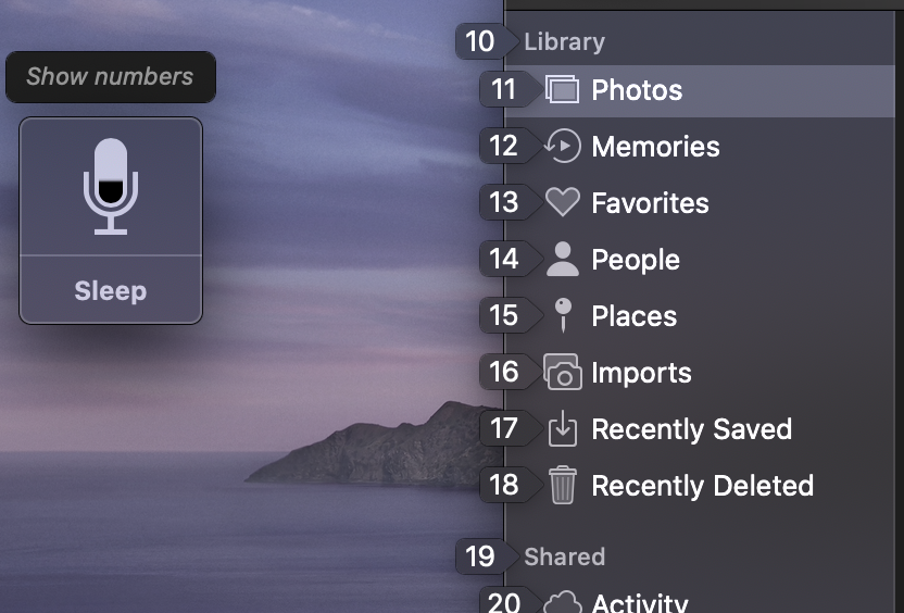
For example, I started with “Open Messages.” Then, “Show Numbers,” which overlays numbers on the variety of different actions. That means instead of saying “compose message” like I might with Siri, I say “15” and then begin inputting text on that line. It’s still early days for the feature, of course, and it may have limited application with some third-party apps, but I’m still glad to see Apple making a point of including it here.

Look for some more hands-on write-ups with various new features in the coming months. The public beta of Catalina drops today. The final version is set for release some time this fall.


from Apple – TechCrunch https://tcrn.ch/2IGpxMg

Sunday, 23 June 2019

Week-in-Review: YouTube’s awful comments and Google’s $1B tech-free investment

Hello, weekend readers. This is Week-in-Review where I give a heavy amount of analysis and/or rambling thoughts on one story while scouring the rest of the hundreds of stories that emerged on TechCrunch this week to surface my favorites for your reading pleasure.

Last week, I talked about how the top gaming industry franchises were proving immortal and how that could change. I mainly asked questions and I got some great answers in my email. Keep the feedback coming.

An interesting corollary to that conversation was Niantic releasing its Harry Potter title this week, a game that takes liberal gameplay cues from Pokémon GO but attaches it to new IP. The big question is whether Niantic can strike gold twice; here’s an Extra Crunch interview my colleague Greg did with the startup’s CEO.


This week, the biggest tech topic at hand from the big companies was probably Facebook’s Libra cryptocurrency, I’d normally dig into that but my colleague Josh did such a bang-up job breaking down Libra and why it’s important that I don’t feel the need to. You can read his explainer below.

Facebook announces Libra cryptocurrency: All you need to know 

In the midst of scouring this week’s headlines, a pretty low-key story from Friday caught my eye detailing how YouTube was testing a version of its app where the comments were hidden by default. Companies test this stuff all the time and it’s hardly a commitment but it did make me reflect on how the nature of user-submitted comments has shifted and how certain platforms develop community cultures based on the way those comments are sorted.

Web comments have been searching for their final form for a while now. Twitter turned comments into the main 140 character dish, but Twitter’s influence is getting baked into a ton of platforms. Sites like Instagram are starting to gain a greater understanding of how users want responses to complement their content and the opportunities they’ve seized on really showcase the user-submitted opportunities being wasted by platforms like YouTube and Twitch.

YouTube downgrading their comment visibility kind of highlights what a cesspool the company has allowed them to turn into, but rather than being a place where people are vile, the platform just hasn’t grown them into something useful or exciting over the past decade.

As Instagram continues to become a place where more and more famous users interact with each other, the comment fields are becoming the place where users “bond” with the accounts they follow even if they’re still lurking around and reading how the account responds to other high-profile users. 

This is how public channels with big audiences should operate. Sure, it’s partially a result of the culture of the platform, but algorithms can shape these cultures.

The issue is so many other comment systems are seemingly organized to treat anonymous users, real-name users and verified personalities the same. Ascribing an equal weight to all of these types of content is kind of a surprisingly quaint way to handle user-generated content, it’s also a great way for platforms to find engagement ceilings and the limits of what spam can become.

You don’t have to go searching far through TechCrunch’s stories to find some good old-fashioned “how I earned $72/hour working from home” spam, but just because something isn’t spam doesn’t means it’s worthwhile. Platforms have developed their own comment memes based on what can play the algorithms, it’s not particularly useful, “Like if Jimmy Fallon brought you here,” “Like if you’re watching this in 2019.”

Platforms organized around building communities have an incentive to elevate anonymous voices and foster relationships and dialogue. Back in the Gawker days, most of my time on the site was spent digging through the comments looking for commenters I recognized and enjoying their dialogue. That’s what Reddit has become in a lot of ways, a place where the posts are secondary to the reactions, but the forum systems of web 1.0 aren’t made for such general influencer-focused platforms of 2019 and it’s an area where there are a lot of wasted opportunities.

YouTube comments have garnered this reputation for being so laughable bad because the company has let the average of what’s submitted define them, acting as a one-size fits all for platforms that are decidedly more dynamic.

Send me feedback
on Twitter @lucasmtny or email
lucas@techcrunch.com

On to the rest of the week’s news.

Trends of the week

Here are a few big news items from big companies, with green links to all the sweet, sweet added context.

  • Tesla paints it black (for a price)
    Tesla is looking to keep those margins hopping and there next play to make your Tesla a bit more pricey is by making the white paint job on its vehicles, making white the standard color. It may seem like a rough deal, especially when you can a monitor stand for your new Apple Display for the same price. Read more here about why Elon did this.
  • Google drops a B on the Bay
    To those living in the arena of Silicon Valley, it’s no secret that the housing shortage is hurting wallets. How much of that is big tech’s fault and how much of it is the local government’s fault is hard to tell at times, but certainly neither is doing as much as they could. This week Google pledged a whopping $1 billion worth of assistance to the problem. Forking over $750 million worth of real estate and a quarter-billion dollars worth of funding for residential projects is quite the pledge, let’s see how the money gets spent. You can read more here.
  • Slate failures
    Google’s Pixel Slate tablet was such hot garbage that the company is leaving the tablet game for good and focusing on its Pixel laptop line instead. Read more here.

GAFA Gaffes

How did the top tech companies screw up this week? This clearly needs its own section, in order of awfulness:

  1. Apple recalls some MacBooks:
    [Apple issues voluntary recall of 2015 MacBook Pro batteries due to overheating concern]
  2. Google swats down shareholder vote:
    [Google defeats shareholders on ‘Dragonfly’ censored search in China]
  3. Facebook in hot water over fake review sales: 
    [Facebook and eBay told to tackle trade in fake reviews]
  4. Maps keeping it real fake:
    [Google responds to report that concluded there are millions of fake business listings on Maps]

Image via Getty Images / Feodora Chiosea

Extra Crunch

Our premium subscription service had another week of interesting deep dives. TechCrunch’s Ron Miller wrote a story asking VCs and CEOs just how much startup founders should be paying themselves.

Startup founders need to decide how much salary is enough

“…Murat Bicer,  general partner at CRV,  says you could probably ask 10 VCs this question, and get 10 different answers, but he sees the range at the low end of perhaps $125,000 and at the high end maybe $200,000, depending on the location of the startup and the cost of living in a particular city…”

Here are some of our other top reads this week for premium subscribers. This week TechCrunch writers talked a bit about keeping your H-1B status and how you should be negotiating your term sheet with strategic investors.

Want more TechCrunch newsletters? Sign up here.


from Apple – TechCrunch https://tcrn.ch/2KzVzvF