In poker, complacency is a quiet killer. It can steal your forward momentum bit by bit, using the warm glow of a winning hand or two to cover the bets you’re not making until it’s too late and you’re out of leverage.
Over the past few years, Apple’s MacBook game had begun to suffer from a similar malaise. Most of the company’s product lines were booming, including newer entries like the Apple Watch, AirPods and iPad Pro. But as problems with the models started to mount — unreliable keyboards, low RAM ceilings and anemic graphics offerings — the once insurmountable advantage that the MacBook had compared to the rest of the notebook industry started to show signs of dwindling.
The new 16” MacBook Pro Apple is announcing today is an attempt to rectify most, if not all, of the major complaints of its most loyal, and vocal, users. It’s a machine that offers a massive amount of upsides for what appears to be a handful of easily justifiable tradeoffs. It’s got better graphics, a bigger display for nearly no extra overall size, a bigger battery with longer life claims and yeah, a completely new keyboard.
I’ve only had a day to use the machine so far, but I did all of my research and writing for this first look piece on the machine, carting it around New York City, through the airport and onto a plane where I’m publishing this now. This isn’t a review, but I can take you through some of the new stuff and give you thoughts based on that chunk of time.
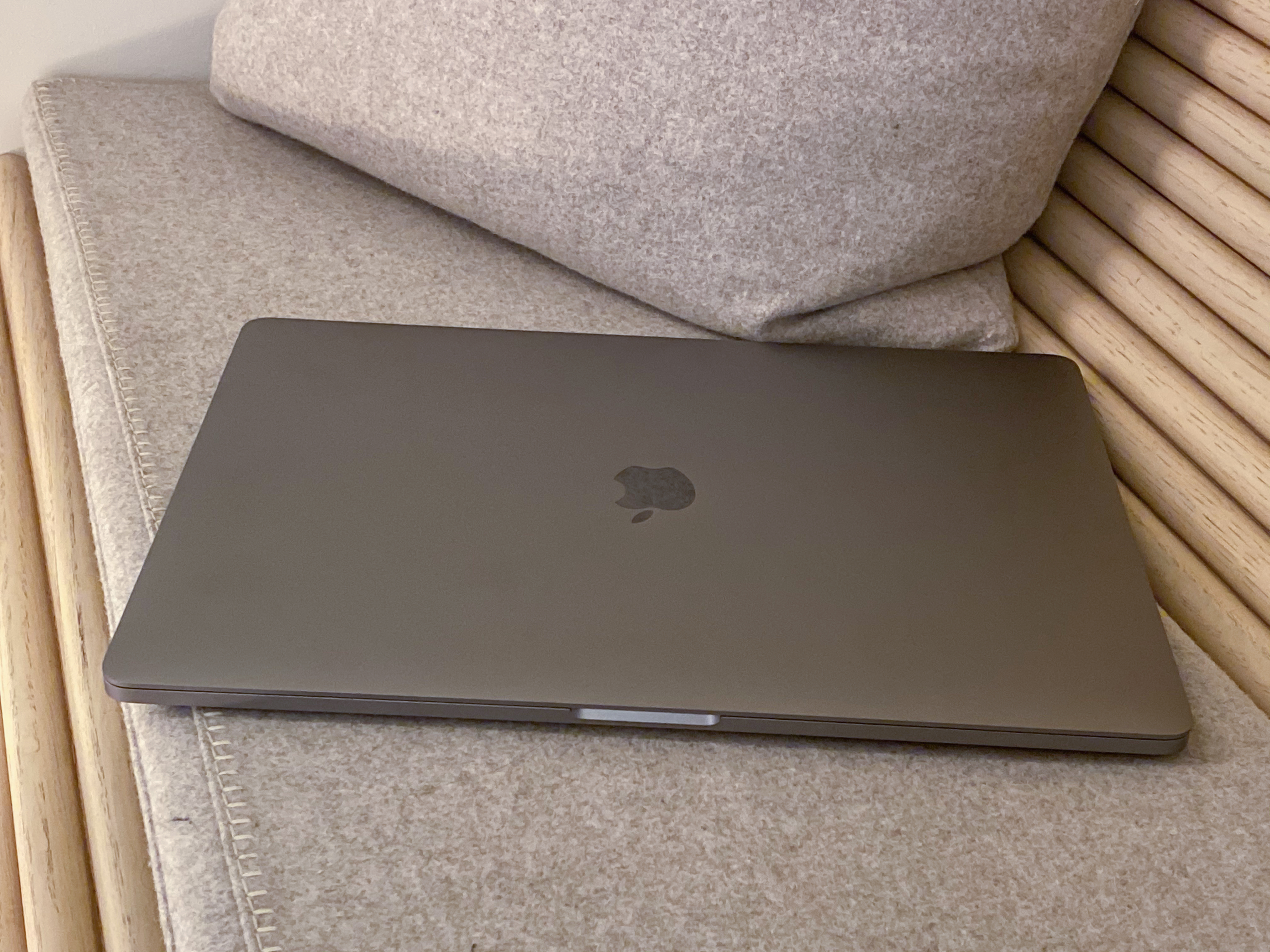 This is a re-think of the larger MacBook Pro in many large ways. This is a brand new model that will completely replace the 15” MacBook Pro in Apple’s lineup, not an additional model.
Importantly, the team working on this new MacBook started with no design constraints on weight, noise, size or battery. This is not a thinner machine, it is not a smaller machine, it is not a quieter machine. It is, however, better than the current MacBook Pro in all of the ways that actually count.
Let’s run down some of the most important new things.
Performance and thermals
The 16” MacBook Pro comes configured with either a 2.6GHz 6-core i7 or a 2.3GHz 8-core i9 from Intel. These are the same processors as the 15” MacBook Pro came with. No advancements here is largely a function of Intel’s chip readiness.
The i7 model of the 16” MacBook Po will run $2,399 for the base model — the same as the old 15” — and it comes with a 512GB SSD drive and 16GB of RAM.
Both models can be ordered today and will be in stores at the end of the week.
The standard graphics configuration in the i7 is an AMD Radeon Pro 5300M with 4GB of memory and an integrated Intel UHD graphics 630 chip. The system continues to use the dynamic handoff system that trades power for battery life on the fly.
The i9 model will run $2,699 and comes with a 1TB drive. That’s a nice bump in storage for both models, into the range of very comfortable for most people. It rolls with an AMD Radeon Pro 5500M with 4GB of memory.
You can configure both models with an AMD Radeon Pro 5500M with 8GB of GDDR6 memory. Both models can also now get up to 8TB of SSD storage – which Apple says is the most on a notebook ever – and 64GB of 2666 DDR4 RAM but I’d expect those upgrades to be pricey.
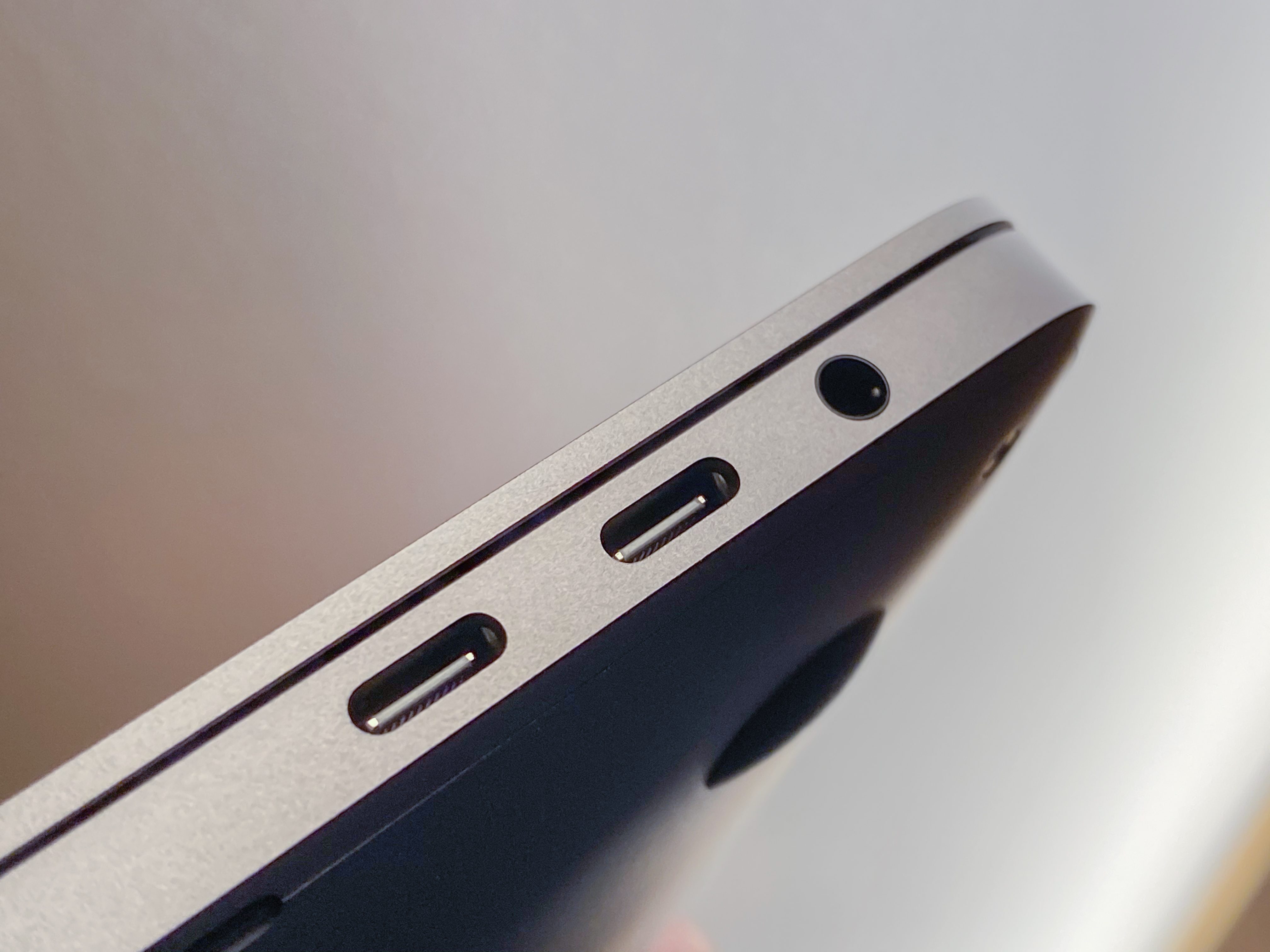
The new power supply delivers an additional 12w of power and there is a new thermal system to compensate for that. The heat pipe that carries air in and out has been redesigned, there are more fan blades on 35% larger fans that move 28% more air compared to the 15” model.
The fans in the MacBook Pro, when active, put out the same decibel level of sound, but push way more air than before. So, not a reduction in sound, but not an increase either — and the trade is better cooling. Another area where the design process for this MacBook focused on performance gains rather than the obvious sticker copy.
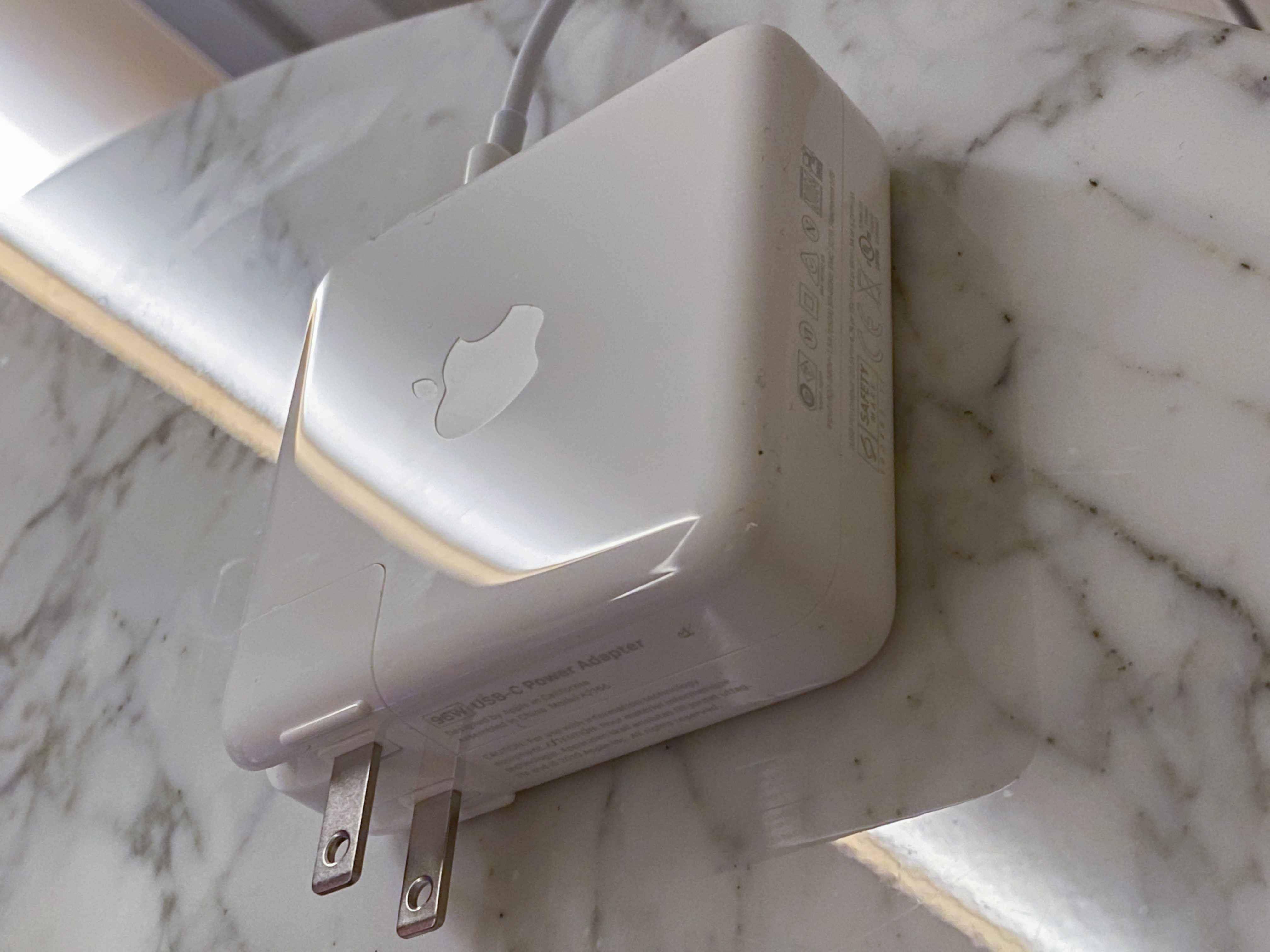 There’s also a new power brick which is the same physical size as the 15” MacBook Pro’s adapter, but which now supplies 96w up from 87w. The brick is still as chunky as ever and feels a tad heavier, but it’s nice to get some additional power out of it.
Though I haven’t been able to put the MacBook Pro through any video editing or rendering tests I was able to see live demos of it handling several 8K streams concurrently. With the beefiest internal config Apple says it can usually handle as many as 4, perhaps 5 un-rendered Pro Res streams.
A bigger display, a thicker body
The new MacBook Pro has a larger 16” diagonal Retina display that has a 3072×1920 resolution at 226 ppi. The monitor features the same 500 nit maximum brightness, P3 color gamut and True Tone tech as the current 15”. The bezels of the screen are narrower, which makes it feel even larger when you’re sitting in front of it. This also contributes to the fact that the overall size of the new MacBook Pro is just 2% larger in width and height, with a .7mm increase in thickness.
 The overall increase in screen size far outstrips the increase in overall body size because of those thinner bezels. And this model is still around the same thickness as the 2015 15” MacBook Pro, an extremely popular model among the kinds of people who are the target market for this machine. It also weighs 4.3 lbs, heavier than the 4.02 lb current 15” model.
The display looks great, extremely crisp due to the increase in pixels and even more in your face because of the very thin bezels. This thing feels like it’s all screen in a way that matches the iPad Pro.
 This thick boi also features a bigger battery, a full 100Whr, the most allowable under current FAA limits. Apple says this contributes an extra hour of normal operations in its testing regimen in comparison to the current 15” MacBook Pro. I have not been able to effectively test these claims in the time I’ve had with it so far.
But it is encouraging that Apple has proven willing to make the iPhone 11 Pro and the new MacBook a bit thicker in order to deliver better performance and battery life. Most of these devices are pretty much thin enough. Performance, please.
Speakers and microphone
One other area where the 16” MacBook Pro has made a huge improvement is the speaker and microphone arrays. I’m not sure I ever honestly expected to give a crap about sound coming out of a laptop. Good enough until I put in a pair of headphones accurately describes my expectations for laptop sound over the years. Imagine my surprise when I first heard the sound coming out of this new MacBook and it was, no crap, incredibly good.
The new array consists of six speakers arranged so that the subwoofers are positioned in pairs, antipodal to one another (back to back). This has the effect of cancelling out a lot of the vibration that normally contributes to that rattle-prone vibrato that has characterized small laptop speakers pretty much forever.
The speaker setup they have here has crisper highs and deeper bass than you’ve likely ever heard from a portable machine. Movies are really lovely to watch with the built ins, a sentence I have never once felt comfortable writing about a laptop.
Apple also vents the speakers through their own chambers, rather than letting sound float out through the keyboard holes. This keeps the sound nice and crisp, with a soundstage that’s wide enough to give the impression of a center channel for voice. One byproduct of this though is that blocking one or another speaker with your hand is definitely more noticeable than before.
The quality of sound here is really very, very good. The HomePod team’s work on sound fields apparently keeps paying dividends.
 That’s not the only audio bit that’s better now though, Apple has also put in a 3-mic array for sound recording that it claims has a high enough signal-to-noise ratio that it can rival standalone microphones. I did some testing here comparing it to the iPhone’s mic and it’s absolutely night and day. There is remarkably little hiss present here and artists that use the MacBook as a sketch pad for vocals and other recording are going to get a really nice little surprise here.
I haven’t been able to test it against external mics myself but I was able to listen to rigs that involved a Blue Yeti and other laptop microphones and the MacBook’s new mic array was clearly better than any of the machines and held its own against the Yeti.
The directional nature of many podcast mics is going to keep them well in advance of the internal mic on the MacBook for the most part, but for truly mobile recording setups the MacBook mic just went from completely not an option to a very viable fallback in one swoop. It really has to be listened to in order to get it.
I doubt anyone is going to buy a MacBook Pro for the internal mic, but having a ‘pro level’ device finally come with a pro level mic on board is super choice.
I think that’s most of it, though I feel like I’m forgetting something…
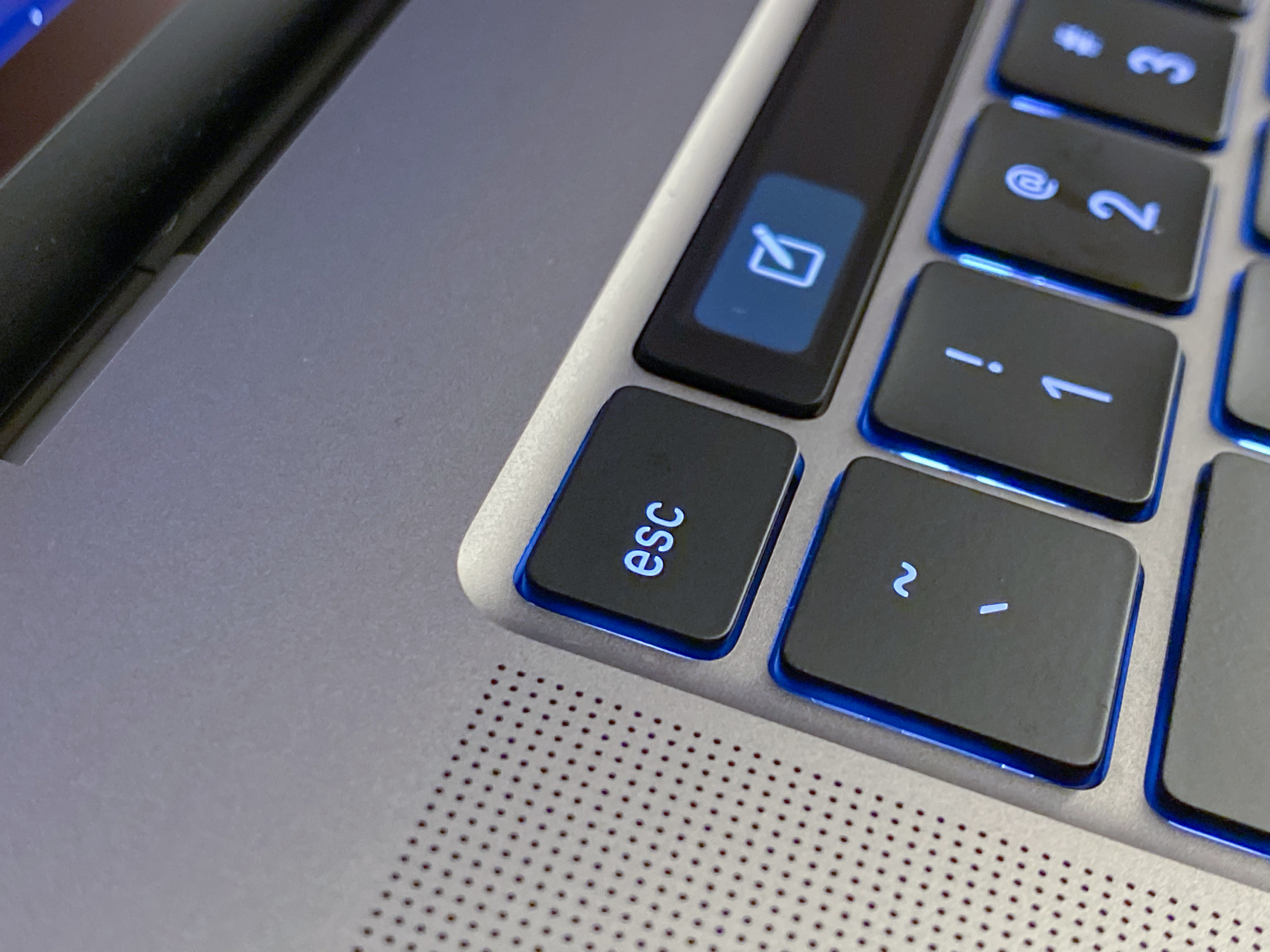
Oh right, the Keyboard
Ah yes. I don’t really need to belabor the point on the MacBook Pro keyboards just not being up to snuff for some time. Whether you weren’t a fan of the short throw on the new butterfly keyboards or you found yourself one of the many people (yours truly included) who ran up against jammed or unresponsive keys on that design — you know that there has been a problem.
The keyboard situation has been written about extensively by Casey Johnston and Joanna Stern and complained about by every writer on Twitter over the past several years. Apple has offered a succession of updates to that keyboard to attempt to make it more reliable and has extended warranty replacements to appease customers.
But the only real solution was to ditch the design completely and start over. And that’s what this is: a completely new keyboard.
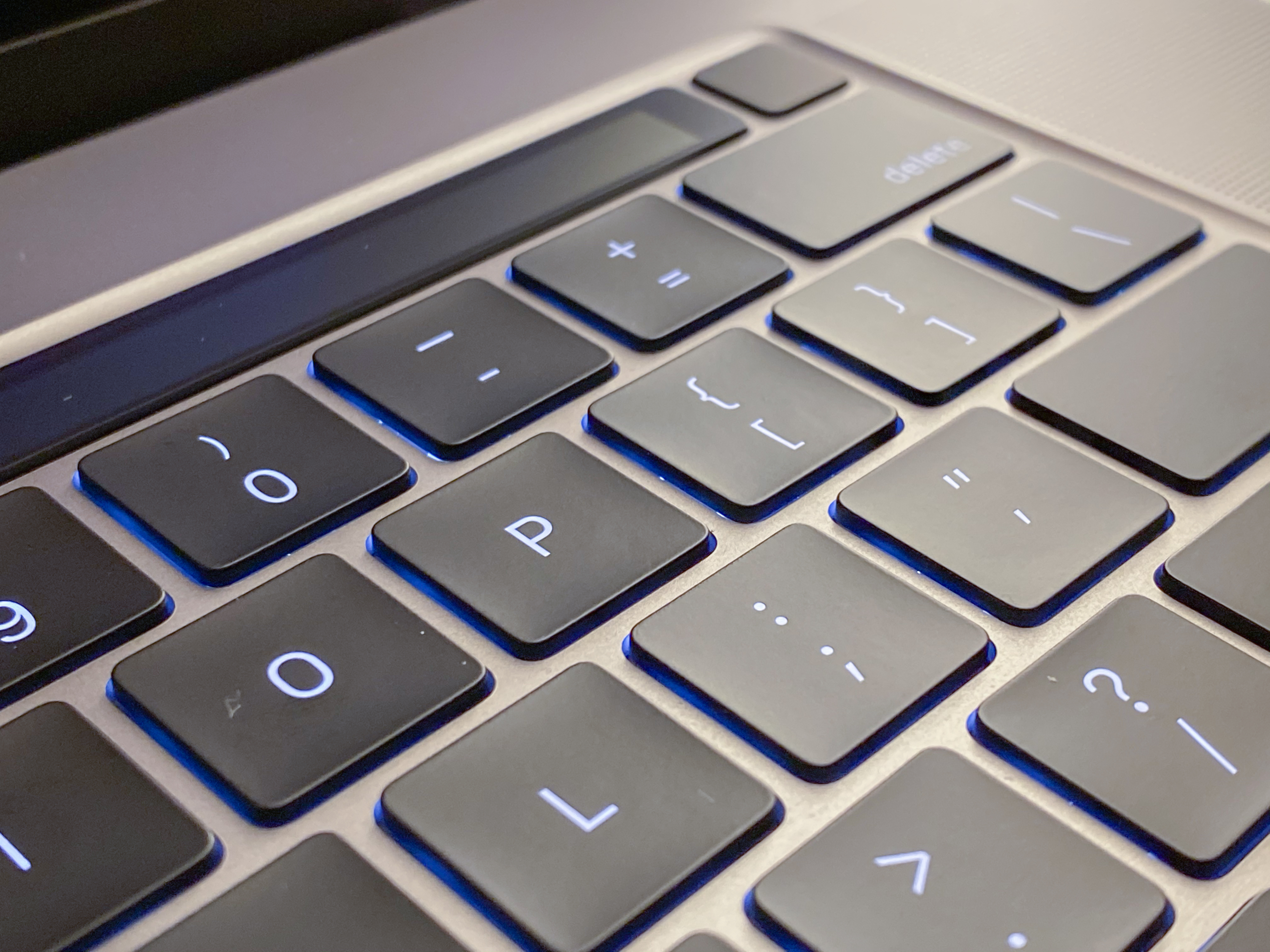
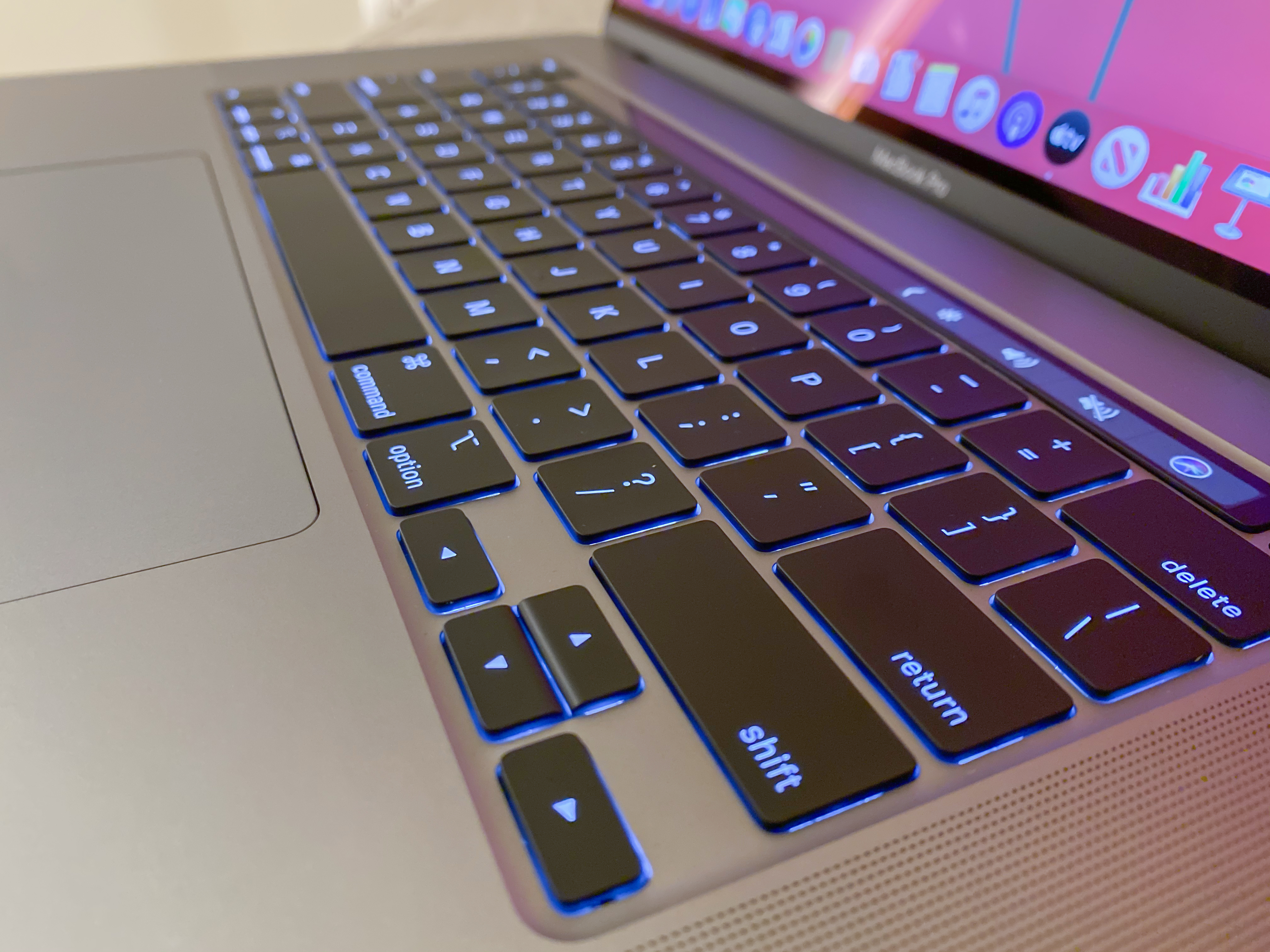
Apple is calling it the Magic Keyboard in homage to the iMac’s Magic Keyboard (but not identically designed). The new keyboard is a scissor mechanism, not butterfly. It has 1mm of key travel (more, a lot more) and an Apple-designed rubber dome under the key that delivers resistance and springback that facilitates a satisfying key action. The new keycaps lock into the keycap at the top of travel to make them more stable when at rest, correcting the MacBook Air-era wobble.
And yes, the keycaps can be removed individually to gain access to the mechanism underneath. And yes, there is an inverted-T arrangement for the arrow keys. And yes, there is a dedicated escape key.
Apple did extensive physiological research when building out this new keyboard. One test was measuring the effect of a keypress on a human finger. Specifically, they measured the effect of a key on the pacinian corpuscles at the tips of your fingers. These are onion-esque structures in your skin that house nerve endings and they are most sensitive to mechanical and vibratory pressure.
Apple then created this specialized plastic dome that sends a specific vibration to this receptor making your finger send a signal to your brain that says ‘hey you pressed that key.’ This led to a design that gives off the correct vibration wavelength to return a satisfying ‘stroke completed’ message to the brain.
 There is also more space between the keys, allowing for more definitive strokes. This is because the keycaps themselves are slightly smaller. The spacing does take some adjustment, but by this point in the article I am already getting pretty proficient and am having more grief from the autocorrect feature of Catalina than anything else.
Notably, this keyboard is not in the warranty extension program that Apple is applying to its older keyboard designs. There is a standard 1 year warranty on this model, a statement by the company that they believe in the durability of this new design? Perhaps. It has to get out there and get bashed on by more violent keyboard jockeys than I for a while before we can tell whether it’s truly more resilient.
But does this all come together to make a more usable keyboard? In short, yes. The best way to describe it in my opinion is a blend between the easy cushion of the old MacBook Air and the low profile stability of the Magic Keyboard for iMac. It’s truly one of the best feeling keyboards they’ve made in years and perhaps ever in the modern era. I reserve the right to be nostalgic about deep throw mechanical keyboards in this regard, but this is the next best thing.
Pro, or Pro
In my brief and admittedly limited testing so far, the 16” MacBook Pro ends up looking like it really delivers on the Pro premise of this kind of machine in ways that have been lacking for a while in Apple’s laptop lineup. The increased storage caps, bigger screen, bigger battery and redesigned keyboard should make this an insta-buy for anyone upgrading from a 2015 MacBook Pro and a very tempting upgrade for even people on newer models that have just never been happy with the typing experience.
Many of Apple’s devices with the label Pro lately have fallen into the bucket of ‘the best’ rather than ‘for professionals’. This isn’t strictly a new phenomenon for Apple, but more consumer centric devices like the AirPods Pro and the iPhone Pro get the label now than ever before.
But the 16” MacBook Pro is going to alleviate a lot of the pressure Apple has been under to provide an unabashedly Pro product for Pro Pros. It’s a real return to form for the real Mack Daddy of the laptop category. As long as this new keyboard design proves resilient and repairable I think this is going to kick off a solid new era for Apple portables.

from iPhone – TechCrunch https://ift.tt/33LDAIq


