Even though Apple did not invent the mouse pointer, history has cemented its place in dragging it out of obscurity and into mainstream use. Its everyday utility, pioneered at Xerox Parc and later combined with a bit of iconic* work from Susan Kare at Apple, has made the pointer our avatar in digital space for nearly 40 years.
The arrow waits on the screen. Slightly angled, with a straight edge and a 45 degree slope leading to a sharp pixel-by-pixel point. It’s an instrument of precision, of tiny click targets on a screen feet away. The original cursor was a dot, then a line pointing straight upwards. It was demonstrated in the ‘Mother of all demos’ — a presentation roughly an hour and a half long that contained not only the world’s first look at the mouse but also hyper linking, document collaboration, video conferencing and more.
The star of the show, though, was the small line of pixels that made up the mouse cursor. It was hominem ex machina — humanity in the machine. Unlike the text entry models of before, which placed character after character in a facsimile of a typewriter, this was a tether that connected us, embryonic, to the aleph. For the first time we saw ourselves awkwardly in a screen.

We don’t know exactly why the original ‘straight up arrow’ envisioned by Doug Engelbart took on the precise angled stance we know today. There are many self-assured conjectures about the change, but few actual answers — all we know for sure is that, like a ready athlete, the arrow pointer has been there, waiting to leap towards our goal for decades. But for the past few years, thanks to touch devices, we’ve had a new, fleshier, sprinter: our finger.
The iPhone and later the iPad didn’t immediately re-invent the cursor. Instead, it removed it entirely. Replacing your digital ghost in the machine with your physical meatspace fingertip. Touch interactions brought with them “stickiness” — the 1:1 mating of intent and action. If you touched a thing, it did something. If you dragged your finger, the content came with it. This, finally, was human-centric computing.
Then, a few weeks ago, Apple dropped a new kind of pointer — a hybrid between these two worlds of pixels and pushes. The iPad’s cursor, I think, deserves closer examination. It’s a seminal bit of remixing from one of the most closely watched idea factories on the planet.
In order to dive a bit deeper on the brand new cursor and its interaction models, I spoke to Apple SVP Craig Federighi about its development and some of the choices by the teams at Apple that made it. First, let’s talk about some of the things that make the cursor so different from what came before…and yet strangely familiar.
—————————
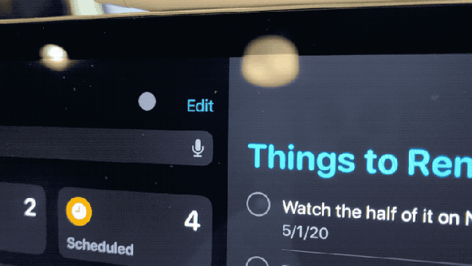
The iPad cursor takes on the shape of a small circle, a normalized version of the way that the screen’s touch sensors read the tip of your finger. Already, this is different. It brings that idea of placing you inside the machine to the next level, blending the physical nature of touch with the one-step-removed trackpad experience.

Its size and shape is also a nod to the nature of iPad’s user interface. It was designed from the ground up as a touch-first experience. So much so that when an app is not properly optimized for that modality it feels awkward, clumsy. The cursor as your finger’s avatar has the same impact wherever it lands.
Honestly, the thinking could have stopped there and that would have been perfectly adequate. A rough finger facsimile as pointer. But the concept is pushed further. As you approach an interactive element, the circle reaches out, smoothly touching then embracing and encapsulating the button.
The idea of variable cursor velocity is pushed further here too. When you’re close to an object on the screen, it changes its rate of travel to get where you want to go quicker, but it does it contextually, rather than linearly, the way that OS X or Windows does.
Predictive math is applied to get you to where you’re going without you having to land precisely there, then a bit of inertia is applied to keep you where you need to be without over shooting it. Once you’re on the icon, small movements of your finger jiggle the icon so you know you’re still there.
The cursor even disappears when you stop moving it, much as the pressure of your finger disappears when you remove it from the screen. And in some cases the cursor possesses the element itself, becoming the button and casting a light ethereal glow around it.

This stir fry of path prediction, animation, physics and fun seasoning is all cooked into a dish that does its best to replicate the feel of something we do without thinking: reaching out and touching something directly.
These are, in design parlance, affordances. They take an operation that is at its base level much harder to do with a touchpad than it is your finger, and make it feel just as easy. All you have to do to render this point in crystal is watch a kid who uses an iPad all day try to use a mouse to accomplish the same task.
The idea that a cursor could change fluidly as needed in context isn’t exactly new. The I-Beam (the cursor type that appears when you hover over editable text) is a good example of this. There were also early experiments at Xerox Parc — the birthplace of the mouse — that also made use of a transforming cursor. They even tried color changes, but never quite got to the concept of on-screen elements as interactive objects — choosing to emulate functions of the keyboard.
But there has never been a cursor like this one. Designed to emulate your finger, but also to spread and squish and blob and rush and rest. It’s a unique addition to the landscape.
—————————
Given how highly scrutinized Apple’s every release is, the iPad cursor not being spoiled is a minor miracle. When it was released as a software update for existing iPads — and future ones — people began testing it immediately and discovering the dramatically different ways that it behaved from its pre-cursors.*
Inside Apple, the team enjoyed watching the speculation externally that Apple was going to pursue a relatively standard path — displaying a pointer on screen on the iPad — and used it as motivation to deliver something more rich, a solution to be paired with the Magic Keyboard. The scuttlebutt was that Apple was going to add cursor support to iPad OS, but even down to the last minute the assumption was that we would see a traditional pointer that brought the iPad as close as possible to ‘laptop’ behavior.
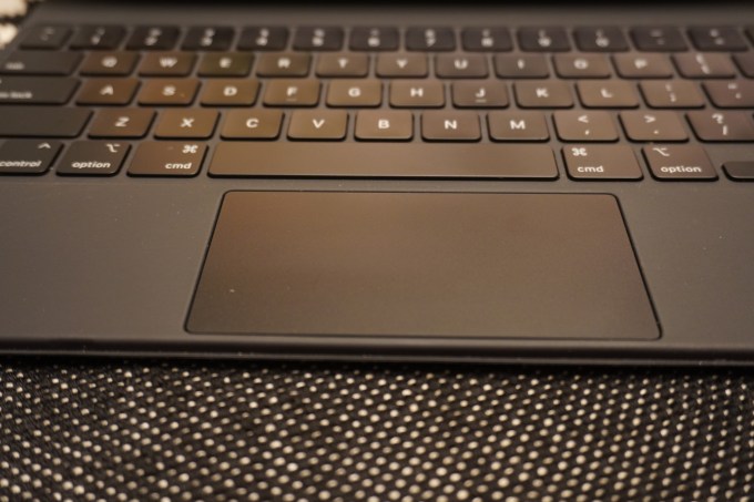
Since the 2018 iPad Pro debuted with the smart connector, those of us that use the iPad Pro daily have been waiting for Apple to ship a ‘real’ keyboard for the device. I went over my experiences with the Smart Keyboard Folio in my review of the new iPad Pro here, and the Magic Keyboard here, but suffice to say that the new design is incredible for heavy typists. And, of course, it brings along a world class trackpad for the ride.
When the team set out to develop the new cursor, the spec called for something that felt like a real pointer experience, but that melded philosophically with the nature of iPad.
A couple of truths to guide the process:
- The iPad is touch first.
- iPad is the most versatile computer that Apple makes.
In some ways, the work on the new iPad OS cursor began with the Apple TV’s refreshed interface back in 2015. If you’ve noticed some similarities between the way that the cursor behaves on iPad OS and the way it works on Apple TV, you’re not alone. There is the familiar ‘jumping’ from one point of interest to another, for instance, and the slight sheen of a button as you move your finger while ‘hovering’ on it.
“There was a process to figure out exactly how various elements would work together,” Federighi says. “We knew we wanted a very touch-centric cursor that was not conveying an unnecessary level of precision. We knew we had a focus experience similar to Apple TV that we could take advantage of in a delightful way. We knew that when dealing with text we wanted to provide a greater sense of feedback.”
“Part of what I love so much about what’s happened with iPadOS is the way that we’ve drawn from so many sources. The experience draws from our work on tvOS, from years of work on the Mac, and from the origins of iPhone X and early iPad, creating something new that feels really natural for iPad.”
And the Apple TV interface didn’t just ‘inspire’ the cursor — the core design team responsible works across groups, including the Apple TV, iPad OS and other products.
—————————
But to understand the process, you have to get a wider view of the options a user has when interacting with an Apple device.
Apple’s input modalities include:
- Mouse (Mac)
- Touchpad (Mac, MacBook, iPad)
- Touch (iPhone, iPad)
- AR (iPhone, iPad, still nascent)
Each of these modalities has situational advantages or disadvantages. The finger, of course, is an imprecise instrument. The team knew that they would have to telegraph the imprecise nature of a finger to the user, but also honor contexts in which precision was needed.
Apple approached the experience going in clean. The team knew that they had the raw elements to make it happen. They had to have a touch sensitive cursor, they knew that the Apple TV cursor showed promise and they knew that more interactive feedback was important when it came to text.
Where and how to apply which element was the big hurdle.
“When we were first thinking about the cursor, we needed it to reflect the natural and easy experience of using your finger when high precision isn’t necessary, like when accessing an icon on the home screen, but it also needed to scale very naturally into high precision tasks like editing text,” says Federighi.
“So we came up with a circle that elegantly transforms to accomplish the task at hand. For example, it morphs to become the focus around a button, or to hop over to another button, or it morphs into something more precise when that makes sense, like the I-beam for text selection.“

The predictive nature of the cursor is the answer that they came up with for “How do you scale a touch analogue into high precision?”
But the team needed to figure out the what situations demanded precision. Interacting with one element over another one close by, for example. That’s where the inertia and snapping came in. The iPad, specifically, is multipurpose computer so it’s way more complex than any single-input device. There are multiple modalities to service with any cursor implementation on the platform. And they have to be honored without tearing down all of the learning that you’ve put millions of users through with a primary touch interface.
“We set out to design the cursor in a way that retains the touch-first experience without fundamentally changing the UI,” Federighi says. “So customers who may never use a trackpad with their iPad won’t have to learn something new, while making it great for those who may switch back and forth between touch and trackpad.”
The team knew that it needed to imbue the cursor with the same sense of fluidity that has become a pillar of the way that iOS works. So they animated it, from dot to I-beam to blob. If you slow down the animation you can see it sprout a bezier curve and flow into its new appearance. This serves the purpose of ‘delighting’ the user — it’s just fun — but it also tells a story about where the cursor is going. This keeps the user in sync with the actions of the blob, which is always a danger any time you introduce even a small amount of autonomy in a user avatar.
Once on the icon, the cursor moves the icon in a small parallax, but this icon shift is simulated — there are not layers here like on Apple TV, but they would be fun to have.
Text editing gets an upgrade as well, with the I-Beam conforming to the size of the text you’re editing, to make it abundantly clear where the cursor will insert and what size of text it will produce when you begin typing.
The web presented its own challenges. The open standard means that many sites have their own hover elements and behaviors. The question that the team had to come to grips with was how far to push conformity to the “rules” of iPad OS and the cursor. The answer was not a one-size application of the above elements. It had to honor the integral elements of the web.
Simply, they knew that people were not going to re-write the web for Apple.
“Perfecting exactly where to apply these elements was an interesting journey. For instance, websites do all manner of things – sometimes they have their own hover experiences, sometimes the clickable area of an element does not match what the user would think of as a selectable area,” he says. “So we looked carefully at where to push what kind of feedback to achieve a really high level of compatibility out the gates with the web as well as with third party apps.”
Any third-party apps that have used the standard iPad OS elements get all of this work for free, of course. It just works. And the implementation for apps that use custom elements is pretty straightforward. Not flick-a-switch simple, but not a heavy lift either.
The response to the cursor support has been hugely positive so far, and that enthusiasm creates momentum. If there’s a major suite of productivity tools that has a solid user base on iPad Pro, you can bet it will get an update. Microsoft, for instance, is working on iPad cursor support that’s expected to ship in Office for iPad this fall.
—————————
System gestures also feel fresh and responsive even on the distanced touchpad. In some ways, the flicking and swiping actually feel more effective and useful on the horizontal than they do on the screen itself. I can tell you from personal experience that context switching back and forth from the screen to the keyboard to switch between workspaces introduces a lot of cognitive wear and tear. Even the act of continuously holding your arm up and out to swipe back and forth between workspaces a foot off the table introduces a longer term fatigue issue.
When the gestures are on the trackpad, they’re more immediate, smaller in overall physical space and less tiring to execute.

“Many iPad gestures on the trackpad are analogous to those on the Mac, so you don’t have to think about them or relearn anything. However, they respond in a different, more immediate way on iPad, making everything feel connected and effortless,” says Federighi.
Remember that the first iPad multitasking gestures felt like a weird offshoot. An experiment that appeared useless at worst but an interesting curiosity at best. Now, on the home button free iPad Pro, the work done by the team that built the iPhone X shines brightly. It’s pretty remarkable that they built a system so usable that it even works on trackpad — one element removed from immediate touch.
Federighi says that they thought about rethinking 3 finger gestures altogether. But they discovered that they work just fine as is. In the case of anything that goes off of the edge you hit a limit and just push beyond it again to confirm and you get the same result.
There are still gaps in the iPad’s cursor paradigms. There is no support for cursor lock on iPad, making it a non starter for relative mouse movement in 3D apps like first person games. There’s more to come, no doubt, but Apple had no comment when I asked about it.
The new iPad cursor is a product of what came before, but it’s blending, rather than layering, that makes it successful in practice. The blending of the product team’s learnings across Apple TV, Mac and iPad. The blending of touch, mouse and touchpad modalities. And, of course, the blending of a desire to make something new and creative and the constraint that it also had to feel familiar and useful right out of the box. It’s a speciality that Apple, when it is at its best, continues to hold central to its development philosophy.

from iPhone – TechCrunch https://ift.tt/3dnbojI